The Origin of a New Game

2011, March 25th 3:05 PM

I've got another megapost percolating, but I saw something from Warren Ellis and had to quote it:

Sometimes it works like this. You can’t choose what part of a story comes to you first. Sometimes you think of a setting first. Sometimes an interesting plot progression drops into your head and you find yourself looking for somewhere to put it, instead. Sometimes it’s the title first, or a character name, or even a line of dialogue from nowhere that kickstarts the whole thing. There’s no hard and fast method, no laws about how this works. Every job is different.

Quite, quite true. You get inspiration where it shows up and you don't complain about it.

Nieuwe Aarde 0.1.1

2011, March 7th 1:22 PM

Windows (.zip version available)
Mac OSX
Linux (32-bit only)

"Wait, Nieuwe Aarde? What's going on? Didn't we already see this game?"

Well, yeah. You did. And you'll be seeing more of it, too!

I've decided to turn Nieuwe Aarde, along with one other game yet to be announced, into a longer-term project. I've got ideas on how to improve it considerably. This isn't really an improved version – this is just a re-release of the version you've played before – but it does have a few improvements.

First off, and most noticably, it has music! I've been collaborating with Robert Seaton with music for a few of my games (and I'll be posting them with music as well, though they won't be getting a long-term treatment.) We did a really neat thing with the music in this game. I'm not going to spoil it, but you should go play it to find out. Seriously it's pretty dang cool.

Second, a common complaint was that increasing your metal and magic in the lategame took far too long. I've added +1000/-1000 buttons as a small hack fix for that.

Third, the rendering engine is far more efficient – the original renderer was quite shockingly bad. Sometimes that's just what happens when you have 48 hours to write a game in. I regret nothing.

Overall, this is the same game . . . but keep an eye on this journal, because I'm going to be making some major changes to it.

Art That Stands The Test Of Time

2011, February 28th 11:17 PM

I just spent a lot of paragraphs talking about Super Meat Boy's artistic choices. Mostly, I talked about what made it a good facsimile of a classic console game while still, in a technical sense, being completely unlike a classic console game.

I didn't talk about what made it good. More importantly, I didn't talk about what "good" means.

From a big-business point of view, "good" is what sells games. That's cool. It's a rational choice. But it's not my choice.

From my point of view, "good" is what makes for good games. And by "good games", I mean "games that people enjoy, and games that people will continue to play well after release". The gaming landscape is littered with games that made a splash, but a stifled one – games that sunk unnoticed after their initial burst of sales. The indie market can't afford to do this. Indie marketing is a slow, gradual beast, and indie developers live or die on their long tail of sales.

That means when you're releasing an indie game, you have to release something that will still be fun a year from now. Two years from now. Five years from now. I can guarantee people will still be buying Braid in five years. I can guarantee people will still be buying Super Meat Boy in five years. And the way you get people to do that – at least, in terms of art – is to make art that lasts.

X-COM UFO Defense. This game's almost old enough to vote – seventeen years and counting. The graphics, by modern standards, are best described as chunky – this was back in the days when we were oh so excited about being able to display 256 colors on a screen at the same time, please ignore that we were restricted to a 320×200 resolution. But despite the chunkiness, they're good. You can see what's going on, the art doesn't induce pain, you get a sense of the world's style. The graphics may be old, but they're competently done and pleasant to look at.


Hold on to your hats, because we've got a shitload of screenshots coming up, all from around the same time period.

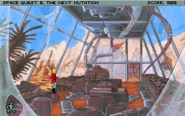
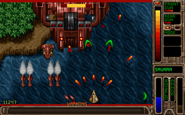
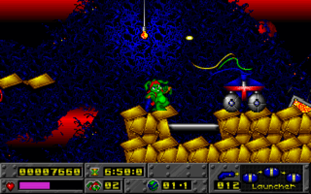
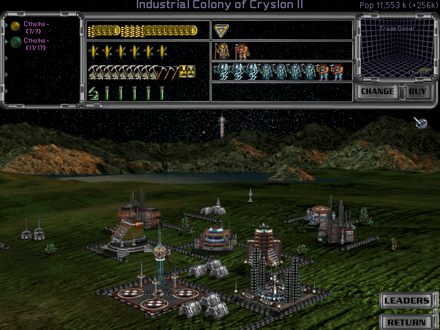
Space Quest 5 was one of the best adventure games of its time. Lavish hand-painted images, gorgeous worlds. Tyrian: a vertical shooter from Epic Megagames. It shipped with half a dozen detail levels, the highest of which would slow even the best computers down to a crawl. Jazz Jackrabbit was a successful attempt to bring the platformer genre over to the PC, merging the speed of Sonic the Hedgehog with the firepower of Doom. Master Of Orion 2 is an old 2d turn-based strategy game, setting you in command of an alien race to conquer the galaxy.


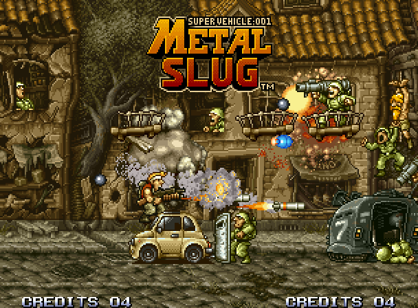
The PC wasn't the only platform with good, solid artwork. The Super Nintendo had its share as well. SNES cartridges were capable of storing up to four megabytes of data (six megabytes, if you pushed real hard) and their developers used this to its full extent. Super Metroid: still possibly the best game in its genre, it provided a gorgeous view into a strange alien planet. Chrono Trigger, a classic RPG, showed us the kind of variety an RPG could give us in graphics. I won't give away the plot twist in Final Fantasy 6, but suffice to say it was fantastically done, and – while it wasn't an SNES game – any discussion of gorgeous pixel art would be incomplete without Metal Slug. Which, if you can believe it, looks substantially better in motion.

All of these games have good graphics. I'm not saying they had good graphics for their time. I'm saying, even today, you can imagine sitting down and playing them. They look better than most modern Flash games.

(And you should play them, by the way. They're all really good. I'm not picking bad games here.)


And some games did not fare as well.

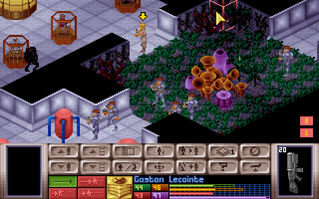
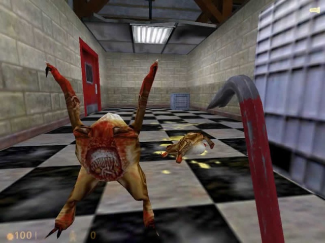
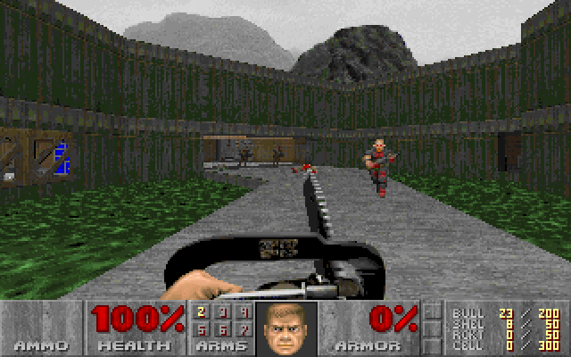
Alone In The Dark: A game that practically created the survival horror game genre. Final Fantasy 7: One of the most beloved RPGs of all time, even more so than Final Fantasy 6. Half-Life: The game that started a modern development behemoth, and one of the highest-rated games ever. Marathon: A relatively unknown first-person shooter that later spawned a somewhat better-known series called Halo. Starfox: The first 3d game on the Super Nintendo, creating an entire still-popular franchise of its own and firmly pushing consoles into the 3d world. And finally, Doom, which may well be the single most influential video game in history.

These are all considered great games. Some of them – perhaps even most of them – were even more groundbreaking and amazing than the games I've listed before. Most of them were released around the same time or later – the 2d games max out at 1995, the 3d games go all the way up to 1999.

But look at them. Seriously. They look like crap. The textures are low-resolution, either chunky or blurry. The models are blocky in the best of cases, and downright polygonal in the worst . . . and that's for the games that weren't using flat resized sprites. It feels like sacrilege saying that Doom is a game that looks bad, but, let's face it, by modern standards, X-COM looks good and Doom looks bad, even though fifteen years ago Doom is the game we were raving about.

All these games were released at roughly the same time, from 1993 for Alone In The Dark to 1998 for Half-Life. The earlier 2d games date 1995 or earlier. But all the 3d games look terrible, and all the 2d games look great. So what gives?

I didn't pick this time period arbitrarily. The mid-90's were the birth of the 3d gaming movement. Before that, we just didn't have the CPU horsepower to do 3d in any useful manner (yes yes, 3d Monster Maze and Catacomb, but I'm not even going to bother posting those). The instant we got 3d capabilities, people started making 3d games. They were new. They were amazing. And we simply didn't have the technology to make them look good.

Today, of course, 3d games are absolutely gorgeous. Photorealistic. Better than photorealistic, in fact. This is a line we've only reached recently, in the last few years. Logically, if we've only reached photorealism recently, that implies that 3d games have only just started looking good, yes?


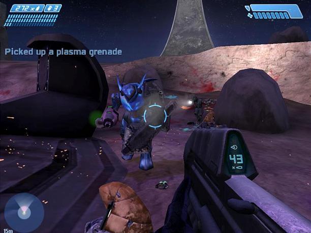
And if you look back just a little, you'll find evidence corroborating this. Halo looked great on release, questionable now. Unreal Tournament 2004 is still a truly enjoyable shooter, but it's quite clearly dated. Serious Sam didn't look all that impressive when it was released, and it certainly hasn't improved. And Doom 3, hailed as a revolutionary graphics advance, is showing its age – blocky, not particularly atmospheric, and old looking. Better than Doom 2. Nowhere near Crysis 2.

And that means that no 3d game, before the present day, will stand up graphically. Right?

Well . . . no.

Not at all, actually.

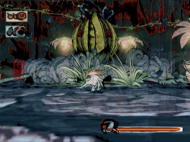
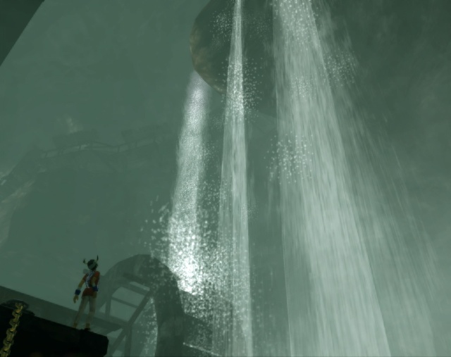
Okami was released in 2006, but don't let the date fool you – it was one of the last games released on the rapidly aging Playstation 2, well after the release of the XBox 360. Its graphics come not from heavy hardware use, nor from a huge investment of money, but from style. Okami is a beautiful game.

Okami is not unique.

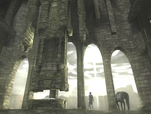
ICO and Shadow of the Colossus, two gorgeous games by the same developers. Shadow of the Colossus is a 2005 release, around the time of Quake 4. Ico was a 2001 release, back in the days of Halo. You can certainly see the lack of good technical backing to Ico, but it doesn't matter. The atmosphere of the game is clear, and the gorgeous art stands out today.

All of these games share something. They share a coherent visual style, one that could be accomplished with the technology of the day. And I do mean accomplished, not approximated. If you made Okami today, it would still look like Okami. If you made ICO today, it would still look like ICO. But if you made Half-Life today, it would look like . . . well, it would look like Half-Life 2 Episode 3. Not like Half-Life.

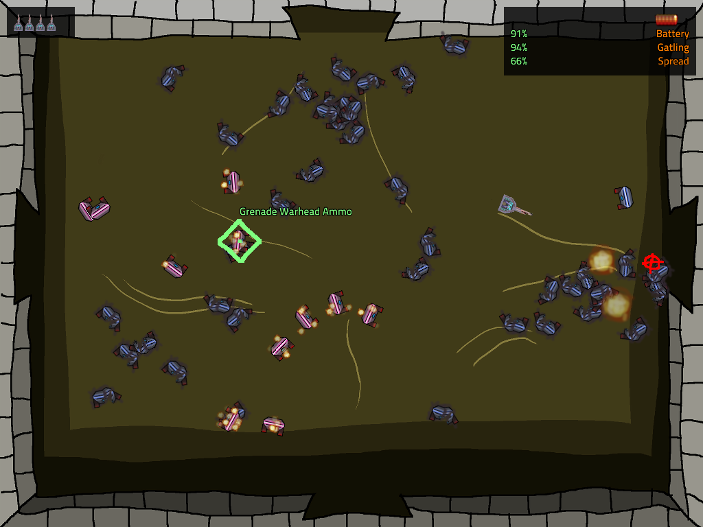
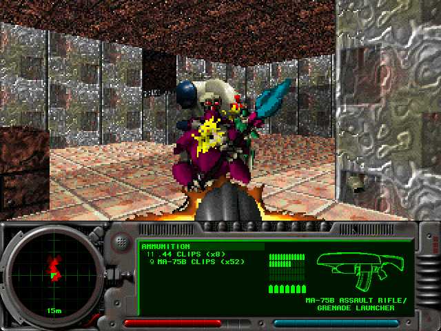
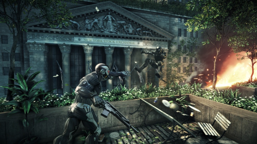
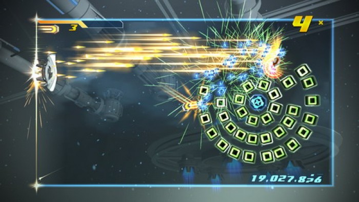
Today, hardware is no longer the issue. We have the hardware to do amazing things, as the above screenshot of Crysis 2 demonstrates. The issue today is money, and this is something that indie developers need to deal with regularly.

The genius of Super Meat Boy's art isn't just that the art is good. It's that the art is inexpensive. I have a hard time imagining that the game cost vastly more than Braid, and Jonathan Blow has estimated that Braid cost $200,000. The credits of Halo indicates that there were at least fifty full-time employees involved there, possibly more, and even calculating it conservatively, $200,000 isn't enough for half a month's salary for that many people.

Today, Halo doesn't look good, and Super Meat Boy does.

The trick for modern indie games is to come up with art styles that are beautiful for what they are. We have the horsepower to do whatever we want, but we don't have the manpower. Luckily, this is nowhere near impossible.


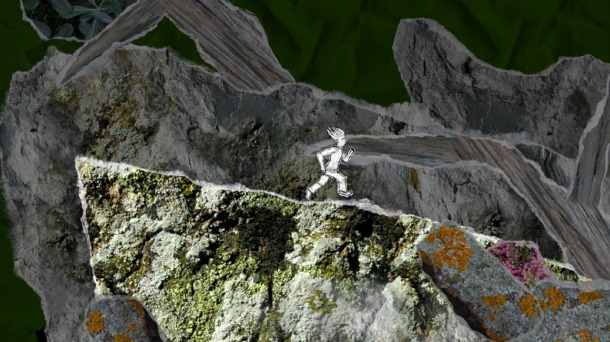
And Yet It Moves: A gravity-based sidescroller, with an art style based around photographs on torn paper. I can't even imagine how cheap the art for this game was, and it forms a visual style that is still nearly unique.

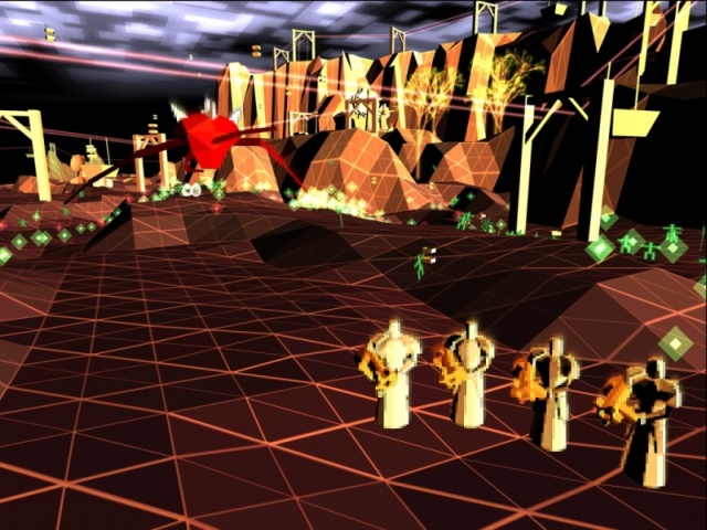
Darwinia: Vector-based realtime strategy game. Us coders love our simple geometric designs with hardware tricks to make it pretty – they're cheap to do and very, very effective, if perhaps a bit cliche.

Gemini Rue: Classic Sierra-style adventure. Is it handpainted? I don't know, but it may as well be. This is a game that would fit in perfectly next to Space Quest 5.

Shatter: I did say we loved our geometric designs! Modern hardware is fast, and with the right backing behind it, that speed can be turned into prettiness without a lot of money. Particles and rendering effects are easy on the wallet and easy on the eyes.

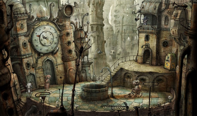
machinarium: When you don't want to do the coding tricks, you can just do 2d handpainted art. And when you're handpainting, why bother with realism? Photorealism is a dead end for the indie developer – it's too hard to get right, and you can fall into the Uncanny Valley without even trying. Graphical style is a much better idea.

The Witness: Light and shadows are one of an indie developer's best tools, and we already visited that in Super Meat Boy. They're computationally expensive, but simple to code, and shockingly beautiful. The Witness is making great use of them, putting more coding muscle behind lighting than many AAA games do.


Design your art so that you can do it competently. It doesn't matter how technologically advanced it is. It doesn't matter how many buzzwords you can fit in. It doesn't matter whether it uses 20% or 90% of someone's graphics card.

What matters is that you know what the goal of your art is, and you choose a goal that you can accomplish.

Ten years from now, nobody will remember the games that pushed the cutting-edge of technology. Nobody will remember the games whose main selling point was how much it would overload your graphics card. The games people will remember are the games that still look good in 2020, the games that still play well even then. And those are the games people will keep buying.

Been awhile since we've had one of these, eh? Let's get some images, too. Images that aren't screencaps of my own games.

Oh man that's so much better.

Super Meat Boy is a truly fantastic indie platformer that came out a few months ago. It's available here, though if you haven't played it by now, it may not be your cup of tea.

You see, Super Meat Boy is hard. Hair-tearingly soul-crushingly ridiculously hard. It is one of the harder games that's come out in the last decade or so. What happened a decade ago? We learned that games should probably be possible.

It might not seem like we had to learn that, but, trust me, we did. For a long period of time, games weren't meant to be possible, they were meant to eat your quarters forever. The more quarters you could convince someone to feed into your arcade machine, the more money you made. This culminated with a rather notorious boss in the Dungeons and Dragons arcade machine that would literally take no damage until you'd put in twenty quarters. That's right: you have to pay five bucks to start killing the boss. Eventually games moved on to consoles and computers, and people stopped having to feed quarters in, and eventually we realized, hey, why not make games have an end? Then it turned out that if you spent a lot of money putting an ending in your game, maybe it was a good idea to, like, let people see it, and so games got a lot easier in the space of a few years.

Some people miss that.

Team Meat missed that.

So they made Super Meat Boy.

Super Meat Boy is a throwback in a lot of ways. First, in terms of its difficulty. But most obviously, its art style. It could be described as "relentlessly retro" – the game is firmly grid-based, the pixels are large and chunky, everything about it says "this is a retro game".

And some parts scream retro. Limited palettes, small assortments of tiles, even less bending of the grid formula. There's slopes in the previous two pictures. There's no slopes here. We don't need slopes. We've got blocks.

What I find most fascinating about Super Meat Boy's art is that it's far, far, far more complex than anything you could do on . . . say . . . a Super Nintendo. Deceptively so. Super Meat Boy's art isn't 16-bit art. It's modern, hardware-accelerated DirectX graphics . . . carefully crafted to be strongly reminiscent of old game consoles, while not actually being old game console art. And curiously, it takes on several "16-bit conventions" that didn't actually exist back in the 16-bit world.

Take a look at an actual 16-bit game, Super Mario World. (In the series Super Mario Brothers. You may notice that Super Meat Boy has the same initials. I would be shocked if this were a coincidence.) Look at what's going on this screeenshot: rounded corners everywhere. The platforms have rounded edges, the blocks are rounded squares. None of that translates into the actual game physics – every ledge behaves like it's a sharp 90 degree angle, the rounding is just there to give it some fancy looks. The floor, and the platforms, have some art going on to give them a little more depth. The background has coloring designed to fake you into thinking it has a lot of depth. Bushes in "front" are darker, bushes in "back" are lighter, and it's all fluffy to make it hard to recognize the tile boundaries.

Two more: Donkey Kong Country and Tales of Phantasia. Look at DKC, first. See just how impenetrable the actual level layout is. There's all kinds of crazy fake-perspective and cleverness going on here – you can't even see the underlying grid. This game makes great use of parallax – as you run, the backgrounds scroll at a different rate, to give an impression of depth.

Tales of Phantasia doesn't do as good a job of hiding the grid, but look at how many tricks they're using to make it still look great. Fake 3d, shadows, objects that don't conform to the grid quite like you'd expect. The grid still exists, but the collision layer doesn't conform directly to it – the collision layer is more complex so they can make rough edges. The grid is still there, they just try to hide it. It's all smoke and mirrors.

Super Meat Boy dispenses with the smoke and mirrors. Platforms have hard edges. There's no fake lighting effects on the platforms themselves, just splashes of red where you walked (Super Meat Boy is a boy who has no skin, and as such, he leaves blood everywhere.) There's often multiple layers of background, as you can see in the first image, but there is a hard divide between the "background layers" on the same plane as Super Meat Boy and the background layers deep, deep behind him. The same-plane background scrolls at the same rate as Super Meat Boy does. The deep background layers are much, much, much slower, giving an illusion of depth with no risk of confusion.

The real 16-bit games did everything they could to escape their 16-bit nature. They pulled every graphical trick and programming trick they could. The modern "16-bit" games revel in it. The sharp corners are emphasized instead of hidden. The backgrounds are set apart from the foregrounds.

It's not about immersion, because if they wanted immersion, they wouldn't be making a 16-bit game. It's about a feel and a concept.

The funny part is when they start using techniques that the "16-bit" games couldn't use in the first place.

1: Take a look at the left side of that pipe. You see the tricky thing?

It's rotated.

The Super Nintendo couldn't do that. The Nintendo absolutely couldn't. Easy use of rotation only showed up as of the PSX era, deep into the realism push.

(Okay, the Super Nintendo sort of could, but only one layer out of its 4. It certainly couldn't rotate multiple things independently unless you had a cartridge with special rendering hardware, like Starfox or Yoshi's Island.)

2: The contrast is a little tricky here, but this comes from the third screenshot up above. It's the same deal as #1: rotated clouds. These clouds zip around the level wildly while you're playing. That's not a 16-bit effect, that's a modern hardware accelerator. Can't fool me!

3: Super Meat Boy has some really wonderful lighting effects. In this case, the pit below Meat Boy is emitting light, which is pouring up through the hole and illuminating everything. Again, this is the kind of thing that the classic consoles just couldn't do. Light compositing takes some moderately hefty hardware, and transparencies only showed up in the Super Nintendo era. In this case it's actually even worse than you'd think. The crumbly-looking blocks that Meat Boy is gripping will actually disintegrate after a second or two of being touched, and the lighting effects adjust instantly. That sort of complex lighting is well out of reach of 16-bit consoles, but because it can be easily applied to "16-bit" worlds, and because it looks really quite awesome, it's common in games like this. See Gish for more examples of this lighting style.

(Also not a coincidence – Gish and Super Meat Boy share a substantial portion of their development staff.)

4: You never see old games intentionally making the world blockier than necessary. They do everything they can to make it less blocky. But take a look at this lava – it's obviously and intentionally chunkier than the rest of the level. Big pixels, about twice as large as the pixels on the solid objects, and they're not even grid-aligned. That's not done for the sake of the hardware. That's a pure stylistic choice.

But if you want a really ridiculous example . . .

5: These pixels aren't even square! Look at them! They're ridiculously tall! And I don't even know what's going on with the pixel sizing. On the edge there's tiny, tiny pixels. In the middle there's big chunky pixels. In the fire, there's pixels of all shapes and sizes, glomped together into a flame effect that looks distinctly old-school while having absolutely nothing in common with old-school platform limitations.

The fact that it's sitting on top of a beautiful and completely non-SNES 45 degree angle is just the crowning touch.

Next time you're playing a fake classic game, look at all the tricks they're using to show you how old the game is meant to look. Next time you're playing a real classic game, look at all the tricks they're using to pretend the game has more detail and beauty than it actually does.

This was meant to be one entry. "Oh, but Zorba, it is one entry!" No it's not. You just haven't seen the second part yet. This will be continued.

Insanely, Ridiculously Busy

2010, December 21st 9:57 PM

I've come up with like four posts I want to make. Half of them are far too short, half of them are far too long.

You're getting "too short" here. Suffice to say that things are churning along, in many different directions, I'm unbelievably busy, and it's all going well.

We'll resume our regular programming eventually. For now, bear with me.

Your Shopping Adventure! Postmortem

2010, November 17th 12:51 AM

I'm having a tough time making a postmortem for this because almost nobody played it. C'mon, people! Gimme something to work with!

I had a few goals for this game.

First off, I wanted to piss off people who thought I was making a sexist game. I got a few bites on that front so I'm considering it a success. Sort-of-unfortunately, everyone laughed it off once they realized what was actually going on. I guess my friends are just too reasonable. I'm not really complaining about this aspect of things.

Second, I was trying to come up with a game that wasn't trivial to minmax. I made great strides in this direction and figured out the first really interesting scoring mechanism I feel I've managed. That, along with the "grades", made for a game where people were competing for highest score. Some of my early testers and most of the people who commented on it later, in fact. That's pretty cool! I thought score was a worthless mechanic, but I may have finally figured out a way to make it worthful: first, make it interesting to max out, and second, introduce goals so people know what they're shooting for. Doubling your score isn't motivating, but getting from a B to an A is damn motivating.

I'll probably write up more on my scoring mechanic later.

Third, I was doing more with 3d. Some of this was successful – the isometric viewpoint turned out pretty neat – but I had trouble getting stuff to work right. I need to learn more about 3d math and I just plain haven't. That's bad. It could have been much better.

Unfortunately, the rest of the game kind of fell flat. The entire thing – to me, at least – feels a bit sterile. I had trouble putting soul into it, like I have with several before, and I'm starting to feel like that's just sort of a random thing. Either it Works, or it Doesn't. K0R and Nieuwe Aarde worked. This one didn't. I'm going to be keeping a close eye on my future games to see what results in style and what results in no style, but that'll take quite a while to narrow down. On the list.

I'd say "it might have been that I had so little time available for this, it was really time-crunched" but I mean look at Nieuwe Aarde which was completely made in basically a state of constant panic, or K0R where I spent almost the entire game development process saying "goddamn, there is no way I'll get this done in time", and . . . well, honestly, being time-crunched generally seems to help. So I have no idea.

In terms of score, I broke fantastic new ground. In terms of everything else . . . well, needs some work, let's say.

Your Shopping Adventure!

2010, October 31st 11:36 PM

Windows (.zip version available)
Mac OSX
Linux (32-bit only)

I told you guys I'd have a game this month, and by Jove I've got a game this month!

(For comedy value: check the timestamp of this post.)

The Experimental Gameplay Project theme this month is Boys And Girls. If we're a boy, we're challenged to make a game that girls will like, and vice-versa. I, of course, decided to make two games. One for each gender! How could this go wrong? I can appeal to everyone!

You should go play it immediately.

Ramsgate

2010, September 28th 2:23 PM

Windows (.zip version available)
Mac OSX
Linux (32-bit only)

A few months ago I did the first Reddit Game Jam. The theme was Opposites, and I managed to finish this shortly before falling asleep on the second day. That same month I'd done some other game (I'm thinking it might have been K0R) and so I never got around to posting this.

Luckily, the terms of the Monthly Game Project don't require that I post a project anywhere near the time of me finishing it! So I've been holding it in reserve for a month when I don't manage to complete a game otherwise. This month is that month, so here's Ramsgate!

Commentary, as always, welcome.


Speaking of the terms of the Monthly Game Project: I've got a few major things possibly coming up that are totally exciting. For example, I may be getting a job working on a commercial game that I think looks damn cool. And I'm putting a lot more time into making Robert Recurring into a commercial indie game.

Guess what I don't have time for anymore?

That's right: the Monthly Game Project.

I'm going to keep posting games when I can, but that might not be once per month. Things may slack off a bit. I'll try to compensate with more journal posts. We'll see how that goes. It is an adventure!

Chassis Commander Postmortem

2010, September 14th 1:03 PM

So, Chassis Commander. The result of Ludum Dare 18. For those who aren't familiar, Ludum Dare is a 48-hour game design contest. You get a theme the instant the timer starts ticking – this theme was "Enemies As Weapons" – and you get to make the best thing you can. Chassis Commander came out as a reasonably solid #37 out of 172 overall, which I think is a rather fair assessment.

And I find myself in a somewhat difficult position. Chassis Commander was fun, but it wasn't really notable. It was kind of average. Now, I'll admit that being able to churn out an average game in 48 hours is pretty goddamn awesome, but it makes it rather difficult to write a reasonable postmortem, since it's tough to say things that are . . . you know . . . interesting.

So here we go anyway.

What Worked: The basic gameplay came down to pretty much what I'd intended. Shoot things a lot, scoop guys up as you go, try to master the new crazy gun you just picked up, repeat. The idea I had was solid and turned out well.

There was a lot of tweaking as I went – you may or may not have noticed the gigantic words that flash up in the center of the screen, for example. Those turned out to be 100% necessary because without them I didn't notice when I was running low on ammo or whatever. Same with the color-coded flashing crosshairs. It's all well and good to say "the game was mediocre", but without some of those extremely critical tweaks the game would have been just plain bad, and I'm glad I noticed and fixed them.

One thing that's consistently amused me is how people tell me they've just been right-clicking on the big monsters to suck them up. Like they're breaking the game somehow. No, that's a strategy! I had intended that to work from the very beginning! Use it! The existence of strategies like this is, I feel, a sign of a not-terrible game. :)

What Didn't Work: There's a few issues that have come to light after release. First, I've had people tell me that the game should weight random pickups towards the item the player needs. Actually, it already does, to something like a tenfold weighting – and it's still not enough. Geesh. So, maybe that should be stronger? Or maybe the item pickup system should work a little differently, so you can build up a small buffer of items and not be so vulnerable to the vagaries of the random-number generator?

I'd intended for the player to be able to intentionally grab specific items to change their gun into something more useful. I've never seen anyone do that. People pretty much right-click on flashing things, or just right-click on monsters. There's not a lot of thought as to gun layout, and I feel like in some ways the game would be better if I got rid of the entire sucking-objects-up mechanic and just handed out guns randomly.

'Course, then it wouldn't conform to the Ludum Dare theme.

I've had some problem with people dying near the end of the level and having their death blast finish the level for them, to the point where I've had a few bug reports that dying makes you go to the next level. I didn't realize how common this would be. Kudos to me for balancing things so that players tend to die at the very end of a level as they're just barely overwhelmed, but I should have realized that would be a bigger problem. The original intention for that mechanic is that I didn't want a player to spawn literally on top of a monster and just die, but obviously the mechanic didn't work properly. I probably should have just blown up monsters around the entry point, or done a classic NES-style "ghost mode" for three seconds or so.

And a small thing, but an important one – it occured to me way too late that I never explained how the ammo types worked. Whoops! I was intending to make the ammo-type change something that had to be done a little intentionally, but at some point that just stopped happening, and I probably should have gotten rid of the ammo-type mechanic entirely.

On a larger level of failure, I'd wanted to have some kind of a "world map" a la Super Smash TV, so you could either beeline for the boss or take a longer route to get more points or coins or McGuffins or whatever. I just didn't have time for this – the final version was released about an hour before LD18 ended. Additionally, I wanted a boss, and I didn't have time for that either. More weapons would've been nice. Again, no time.

The Bottom Line: I made a good game, but there's something missing. I look at games like K0R or Nieuwe Aarde and there's a certain level of style and hook that pulls people in. Chassis Commander doesn't have that, and I'm not entirely sure why. I lost a bit of the design charm for this game and I'm gonna have to figure out what happened and how to fix it.

Chassis Commander

2010, August 25th 1:36 PM

Windows (.zip version)
Mac OSX
Linux (32-bit only)

CHASSIS COMMANDER!

Marooned on an unknown planet!

CHASSIS COMMANDER!

His only weapon, a hoverbike with a malfunctioning weapon!

CHASSIS COMMANDER!

Besieged by a million unstoppable robots!

CHASSIS COMMANDER! (you should be imagining this with a significant amount of reverb btw, go back to the beginning and start again if you're not)

Can he use the robots to repair his vehicle? Can he muster up enough firepower to defeat them all? Can he learn how to use the over-100 unique weapons that he can cobble together from compressed robot parts? Can he survive this horrible onslaught?!

CHASSIS COMMANDER!

Play it today!

(Ludum Dare 18 submission. Made in 48 hours.)