Reflecting the World with the Game

2012, September 30th 10:35 AM

There's these two board games: Arkham Horror and Betrayal at House on the Hill. They're both horror games, in a sense. Arkham is Lovecraftian horror, Betrayal is horror-movie style. I've played a lot of both of them, and they both do a great job of atmosphere – but while a good deal of this atmosphere is conveyed through writing, some of it is conveyed through a far more important and far more subtle manner: the very rules that the game runs on.

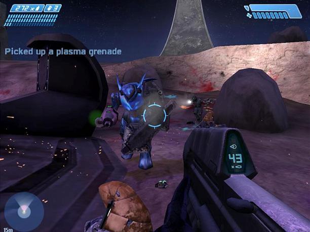
A theme of Lovecraftian horror is that, fundamentally, the world isn't an evil place. Sure, there are evils in the world – a whole shitload of them, actually – but until someone has actually been influenced by an Elder God, they're probably a good person. Almost all the evils in Arkham Horror are explicitly set apart as something unworldly: an invader from another plane of existence or a minion of that invader.

Betrayal is the exact opposite. Betrayal takes place inside a haunted house, and no doubt about it, the house hates you. The only things in this world that are on your side are your friends, and even one of those is going to betray you. The world of Betrayal is explicitly malicious and is constantly out for your blood.

Each game manages to demonstrate this through game mechanics.

In Arkham, the world's alliance with you is reflected in several ways. The game is cooperative, and almost all conflicts are phrased as "player vs. monster". When a tie happens, the player will generally win that tie. Second, situations where a value needs to be rounded are generally rounded in the player's favor. Finally, random events – the thing you spend a good deal of the game doing – are generally good things, giving you money, clues, items, or other minor bonuses.

Betrayal, despite also being mostly cooperative player-vs-monster, works quite differently. Ties are generally considered losses. Rounding is always against you. And random events, while sometimes good, tend to be harmful, gradually stripping away your stats or giving major penalties – the game is a race against your own inevitable death at the hands of the House.

I've always liked this method of creating atmosphere, but surprisingly few games do it. Most games either have very little connection between the mechanics and the environment, or the two are so deeply intertwined that there's nothing subtle about it. Not, by the way, that either of these things are bad – I'm not suggesting that Bejeweled needs to weave plot threads into its game mechanics somehow, nor that Braid was worse off by presenting a highly unified front to the player – but subtle atmosphere is an important part of a designer's toolkit, and it's something that board game designers have tackled with great success.

Luckily, it's not completely unheard of in the game world, so I can give a few examples.

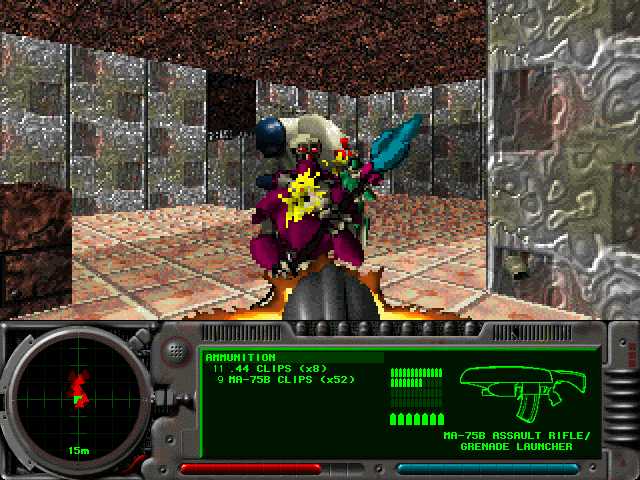
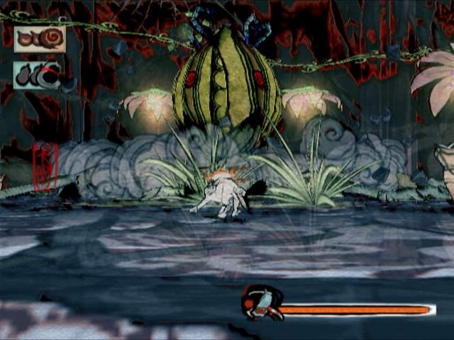
Demon's Souls is a hardcore dungeon crawler released a few years back. There has since been a spiritual successor, Dark Souls, that I've heard is quite good, but I haven't yet played it so I'll be talking about Demon's Souls.

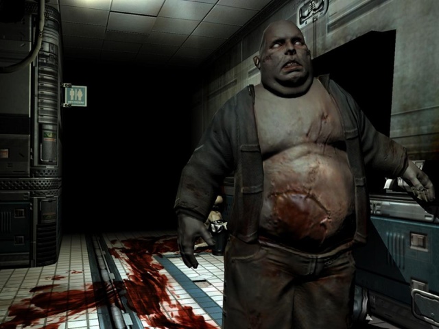
In Demon's Souls, the world is out to kill you. Violently, rapidly, and efficiently. When it does – and it will, frequently – you lose all your hard-earned money. (Represented, in this game, by souls.) You're sent back to the beginning of the level, and the levels are quite long. Worse, the game doesn't get easier on the second try – no, now you're considered a ghost, and you have half as much life. And if you die more, the enemies get harder. That's right: Losing makes the game harder. This isn't a game where you get to keep making gradual progress despite dying, this is a game where dying makes anti-progress.

You know how many games have "town", or a "trade hub", or some other location that you can go in order to buy and sell stuff and stock up for your next run? Demon's Souls has that. And if you go the wrong way, you can die in town. And come back as a ghost, with half health. And the enemies got harder. And you lost all your souls. From dying in the safest part in the game. Good fuckin' job, man.

All of these mechanics fit the game style perfectly. The world of Demon's Souls is brutal – the backstory is about a war that has, in all practicality, already been lost, and the game reflects that. But importantly, none of the mechanics are unfair. The game never randomly kills you. It kills you because you screwed up, and then it kills you again in the exact same spot because you screwed up in the exact same way in that exact same spot. The lack of randomness is reflected in the game's storyline – the Bad Things didn't form out of nothing, they didn't just show up one day and decide to start fucking up the kingdom. They showed up because the king did something very, very bad, and now you get to suffer for it.

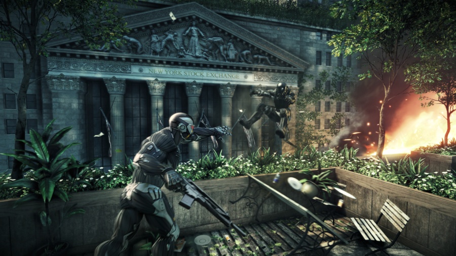
Borderlands, in many ways, is the exact opposite. Sure, the Borderlands game mechanics are also out to kill you, no arguments, but they'll give you every possible opportunity to survive while doing so. Running away is effective. Many characters have survival skills. "Dying" results in a period of time when you're lying on the ground wounded, but can still shoot things, and if you kill an enemy, you'll be instantly revived. And even if all that fails, you'll find yourself resurrected nearby with no loss besides a little bit of money. Not much money. Just a little. Plus you get some free ammo, just in case you ran out. And all the bad guys you killed? Still dead. Having trouble with a boss? Just keep throwing yourself at it, it'll go down eventually. Killing enemies is often rewarded by random guns appearing out of thin air, ammunition and health absolutely litters the game stashed away in chests, boxes, and even mounds of dirt, and the general philosophy if you're about to run out of something is to simply not worry – more will be along shortly.

On first inspection, the world of Borderlands seems like a grim brutal struggle for survival, but if you look a bit deeper it's a cartoony jokey "struggle". Sure, you slaughter nameless mooks by the thousand, but anyone with an actual name is guaranteed to survive until their plotline is resolved. Betrayal is rare and generally strongly telegraphed, wealth and riches seem to simply fall out of the sky for people to collect, and even the craziest nutcases find a successful niche to survive in.

(In the Borderlands world, even the average character is more than a little nuts. The craziest ones are truly out there.)

The interesting part about Borderlands is that the plot, originally, was quite different. Borderlands was developed as a gritty scifi roleplaying shooter, full of all the science fiction paraphernalia that we've grown to love from games like Mass Effect. But many of final non-gritty game mechanics were already in place. You'd shoot a horrible monster in the face, a gun would pop out. You'd walk around the world and find chests of ammo just sitting there. The game world and the game mechanics were in conflict – the mechanics kept saying "hey, look how ridiculous this all is, look how many guns you have, it's so many guns", and the plot kept insisting that this was a serious game with a serious plotline meant to be taken very seriously.

Compare the original trailer:

With the release trailer:

And then compare that with the Borderlands 2 trailer, which continues the path taken by the art revamp:

To wrap this all up:

Game developers have a tendency to consider the game mechanics and the setting to be two different things. In reality, they aren't – they're two parts of the same game, and at the very least they need to coexist peacefully. Ideally, they should riff off each other: both the game mechanics and the theme should be based around the same atmosphere. People will accept a brutally hardcore game if the setting feels appropriate, and people will accept a massively exaggerated game if the setting feels appropriate, but with an inappropriate combination, the game will feel jarring and out-of-place.

Art That Stands The Test Of Time

2011, February 28th 11:17 PM

I just spent a lot of paragraphs talking about Super Meat Boy's artistic choices. Mostly, I talked about what made it a good facsimile of a classic console game while still, in a technical sense, being completely unlike a classic console game.

I didn't talk about what made it good. More importantly, I didn't talk about what "good" means.

From a big-business point of view, "good" is what sells games. That's cool. It's a rational choice. But it's not my choice.

From my point of view, "good" is what makes for good games. And by "good games", I mean "games that people enjoy, and games that people will continue to play well after release". The gaming landscape is littered with games that made a splash, but a stifled one – games that sunk unnoticed after their initial burst of sales. The indie market can't afford to do this. Indie marketing is a slow, gradual beast, and indie developers live or die on their long tail of sales.

That means when you're releasing an indie game, you have to release something that will still be fun a year from now. Two years from now. Five years from now. I can guarantee people will still be buying Braid in five years. I can guarantee people will still be buying Super Meat Boy in five years. And the way you get people to do that – at least, in terms of art – is to make art that lasts.

X-COM UFO Defense. This game's almost old enough to vote – seventeen years and counting. The graphics, by modern standards, are best described as chunky – this was back in the days when we were oh so excited about being able to display 256 colors on a screen at the same time, please ignore that we were restricted to a 320×200 resolution. But despite the chunkiness, they're good. You can see what's going on, the art doesn't induce pain, you get a sense of the world's style. The graphics may be old, but they're competently done and pleasant to look at.


Hold on to your hats, because we've got a shitload of screenshots coming up, all from around the same time period.

Space Quest 5 was one of the best adventure games of its time. Lavish hand-painted images, gorgeous worlds. Tyrian: a vertical shooter from Epic Megagames. It shipped with half a dozen detail levels, the highest of which would slow even the best computers down to a crawl. Jazz Jackrabbit was a successful attempt to bring the platformer genre over to the PC, merging the speed of Sonic the Hedgehog with the firepower of Doom. Master Of Orion 2 is an old 2d turn-based strategy game, setting you in command of an alien race to conquer the galaxy.


The PC wasn't the only platform with good, solid artwork. The Super Nintendo had its share as well. SNES cartridges were capable of storing up to four megabytes of data (six megabytes, if you pushed real hard) and their developers used this to its full extent. Super Metroid: still possibly the best game in its genre, it provided a gorgeous view into a strange alien planet. Chrono Trigger, a classic RPG, showed us the kind of variety an RPG could give us in graphics. I won't give away the plot twist in Final Fantasy 6, but suffice to say it was fantastically done, and – while it wasn't an SNES game – any discussion of gorgeous pixel art would be incomplete without Metal Slug. Which, if you can believe it, looks substantially better in motion.

All of these games have good graphics. I'm not saying they had good graphics for their time. I'm saying, even today, you can imagine sitting down and playing them. They look better than most modern Flash games.

(And you should play them, by the way. They're all really good. I'm not picking bad games here.)


And some games did not fare as well.

Alone In The Dark: A game that practically created the survival horror game genre. Final Fantasy 7: One of the most beloved RPGs of all time, even more so than Final Fantasy 6. Half-Life: The game that started a modern development behemoth, and one of the highest-rated games ever. Marathon: A relatively unknown first-person shooter that later spawned a somewhat better-known series called Halo. Starfox: The first 3d game on the Super Nintendo, creating an entire still-popular franchise of its own and firmly pushing consoles into the 3d world. And finally, Doom, which may well be the single most influential video game in history.

These are all considered great games. Some of them – perhaps even most of them – were even more groundbreaking and amazing than the games I've listed before. Most of them were released around the same time or later – the 2d games max out at 1995, the 3d games go all the way up to 1999.

But look at them. Seriously. They look like crap. The textures are low-resolution, either chunky or blurry. The models are blocky in the best of cases, and downright polygonal in the worst . . . and that's for the games that weren't using flat resized sprites. It feels like sacrilege saying that Doom is a game that looks bad, but, let's face it, by modern standards, X-COM looks good and Doom looks bad, even though fifteen years ago Doom is the game we were raving about.

All these games were released at roughly the same time, from 1993 for Alone In The Dark to 1998 for Half-Life. The earlier 2d games date 1995 or earlier. But all the 3d games look terrible, and all the 2d games look great. So what gives?

I didn't pick this time period arbitrarily. The mid-90's were the birth of the 3d gaming movement. Before that, we just didn't have the CPU horsepower to do 3d in any useful manner (yes yes, 3d Monster Maze and Catacomb, but I'm not even going to bother posting those). The instant we got 3d capabilities, people started making 3d games. They were new. They were amazing. And we simply didn't have the technology to make them look good.

Today, of course, 3d games are absolutely gorgeous. Photorealistic. Better than photorealistic, in fact. This is a line we've only reached recently, in the last few years. Logically, if we've only reached photorealism recently, that implies that 3d games have only just started looking good, yes?


And if you look back just a little, you'll find evidence corroborating this. Halo looked great on release, questionable now. Unreal Tournament 2004 is still a truly enjoyable shooter, but it's quite clearly dated. Serious Sam didn't look all that impressive when it was released, and it certainly hasn't improved. And Doom 3, hailed as a revolutionary graphics advance, is showing its age – blocky, not particularly atmospheric, and old looking. Better than Doom 2. Nowhere near Crysis 2.

And that means that no 3d game, before the present day, will stand up graphically. Right?

Well . . . no.

Not at all, actually.

Okami was released in 2006, but don't let the date fool you – it was one of the last games released on the rapidly aging Playstation 2, well after the release of the XBox 360. Its graphics come not from heavy hardware use, nor from a huge investment of money, but from style. Okami is a beautiful game.

Okami is not unique.

ICO and Shadow of the Colossus, two gorgeous games by the same developers. Shadow of the Colossus is a 2005 release, around the time of Quake 4. Ico was a 2001 release, back in the days of Halo. You can certainly see the lack of good technical backing to Ico, but it doesn't matter. The atmosphere of the game is clear, and the gorgeous art stands out today.

All of these games share something. They share a coherent visual style, one that could be accomplished with the technology of the day. And I do mean accomplished, not approximated. If you made Okami today, it would still look like Okami. If you made ICO today, it would still look like ICO. But if you made Half-Life today, it would look like . . . well, it would look like Half-Life 2 Episode 3. Not like Half-Life.

Today, hardware is no longer the issue. We have the hardware to do amazing things, as the above screenshot of Crysis 2 demonstrates. The issue today is money, and this is something that indie developers need to deal with regularly.

The genius of Super Meat Boy's art isn't just that the art is good. It's that the art is inexpensive. I have a hard time imagining that the game cost vastly more than Braid, and Jonathan Blow has estimated that Braid cost $200,000. The credits of Halo indicates that there were at least fifty full-time employees involved there, possibly more, and even calculating it conservatively, $200,000 isn't enough for half a month's salary for that many people.

Today, Halo doesn't look good, and Super Meat Boy does.

The trick for modern indie games is to come up with art styles that are beautiful for what they are. We have the horsepower to do whatever we want, but we don't have the manpower. Luckily, this is nowhere near impossible.


And Yet It Moves: A gravity-based sidescroller, with an art style based around photographs on torn paper. I can't even imagine how cheap the art for this game was, and it forms a visual style that is still nearly unique.

Darwinia: Vector-based realtime strategy game. Us coders love our simple geometric designs with hardware tricks to make it pretty – they're cheap to do and very, very effective, if perhaps a bit cliche.

Gemini Rue: Classic Sierra-style adventure. Is it handpainted? I don't know, but it may as well be. This is a game that would fit in perfectly next to Space Quest 5.

Shatter: I did say we loved our geometric designs! Modern hardware is fast, and with the right backing behind it, that speed can be turned into prettiness without a lot of money. Particles and rendering effects are easy on the wallet and easy on the eyes.

machinarium: When you don't want to do the coding tricks, you can just do 2d handpainted art. And when you're handpainting, why bother with realism? Photorealism is a dead end for the indie developer – it's too hard to get right, and you can fall into the Uncanny Valley without even trying. Graphical style is a much better idea.

The Witness: Light and shadows are one of an indie developer's best tools, and we already visited that in Super Meat Boy. They're computationally expensive, but simple to code, and shockingly beautiful. The Witness is making great use of them, putting more coding muscle behind lighting than many AAA games do.


Design your art so that you can do it competently. It doesn't matter how technologically advanced it is. It doesn't matter how many buzzwords you can fit in. It doesn't matter whether it uses 20% or 90% of someone's graphics card.

What matters is that you know what the goal of your art is, and you choose a goal that you can accomplish.

Ten years from now, nobody will remember the games that pushed the cutting-edge of technology. Nobody will remember the games whose main selling point was how much it would overload your graphics card. The games people will remember are the games that still look good in 2020, the games that still play well even then. And those are the games people will keep buying.

Been awhile since we've had one of these, eh? Let's get some images, too. Images that aren't screencaps of my own games.

Oh man that's so much better.

Super Meat Boy is a truly fantastic indie platformer that came out a few months ago. It's available here, though if you haven't played it by now, it may not be your cup of tea.

You see, Super Meat Boy is hard. Hair-tearingly soul-crushingly ridiculously hard. It is one of the harder games that's come out in the last decade or so. What happened a decade ago? We learned that games should probably be possible.

It might not seem like we had to learn that, but, trust me, we did. For a long period of time, games weren't meant to be possible, they were meant to eat your quarters forever. The more quarters you could convince someone to feed into your arcade machine, the more money you made. This culminated with a rather notorious boss in the Dungeons and Dragons arcade machine that would literally take no damage until you'd put in twenty quarters. That's right: you have to pay five bucks to start killing the boss. Eventually games moved on to consoles and computers, and people stopped having to feed quarters in, and eventually we realized, hey, why not make games have an end? Then it turned out that if you spent a lot of money putting an ending in your game, maybe it was a good idea to, like, let people see it, and so games got a lot easier in the space of a few years.

Some people miss that.

Team Meat missed that.

So they made Super Meat Boy.

Super Meat Boy is a throwback in a lot of ways. First, in terms of its difficulty. But most obviously, its art style. It could be described as "relentlessly retro" – the game is firmly grid-based, the pixels are large and chunky, everything about it says "this is a retro game".

And some parts scream retro. Limited palettes, small assortments of tiles, even less bending of the grid formula. There's slopes in the previous two pictures. There's no slopes here. We don't need slopes. We've got blocks.

What I find most fascinating about Super Meat Boy's art is that it's far, far, far more complex than anything you could do on . . . say . . . a Super Nintendo. Deceptively so. Super Meat Boy's art isn't 16-bit art. It's modern, hardware-accelerated DirectX graphics . . . carefully crafted to be strongly reminiscent of old game consoles, while not actually being old game console art. And curiously, it takes on several "16-bit conventions" that didn't actually exist back in the 16-bit world.

Take a look at an actual 16-bit game, Super Mario World. (In the series Super Mario Brothers. You may notice that Super Meat Boy has the same initials. I would be shocked if this were a coincidence.) Look at what's going on this screeenshot: rounded corners everywhere. The platforms have rounded edges, the blocks are rounded squares. None of that translates into the actual game physics – every ledge behaves like it's a sharp 90 degree angle, the rounding is just there to give it some fancy looks. The floor, and the platforms, have some art going on to give them a little more depth. The background has coloring designed to fake you into thinking it has a lot of depth. Bushes in "front" are darker, bushes in "back" are lighter, and it's all fluffy to make it hard to recognize the tile boundaries.

Two more: Donkey Kong Country and Tales of Phantasia. Look at DKC, first. See just how impenetrable the actual level layout is. There's all kinds of crazy fake-perspective and cleverness going on here – you can't even see the underlying grid. This game makes great use of parallax – as you run, the backgrounds scroll at a different rate, to give an impression of depth.

Tales of Phantasia doesn't do as good a job of hiding the grid, but look at how many tricks they're using to make it still look great. Fake 3d, shadows, objects that don't conform to the grid quite like you'd expect. The grid still exists, but the collision layer doesn't conform directly to it – the collision layer is more complex so they can make rough edges. The grid is still there, they just try to hide it. It's all smoke and mirrors.

Super Meat Boy dispenses with the smoke and mirrors. Platforms have hard edges. There's no fake lighting effects on the platforms themselves, just splashes of red where you walked (Super Meat Boy is a boy who has no skin, and as such, he leaves blood everywhere.) There's often multiple layers of background, as you can see in the first image, but there is a hard divide between the "background layers" on the same plane as Super Meat Boy and the background layers deep, deep behind him. The same-plane background scrolls at the same rate as Super Meat Boy does. The deep background layers are much, much, much slower, giving an illusion of depth with no risk of confusion.

The real 16-bit games did everything they could to escape their 16-bit nature. They pulled every graphical trick and programming trick they could. The modern "16-bit" games revel in it. The sharp corners are emphasized instead of hidden. The backgrounds are set apart from the foregrounds.

It's not about immersion, because if they wanted immersion, they wouldn't be making a 16-bit game. It's about a feel and a concept.

The funny part is when they start using techniques that the "16-bit" games couldn't use in the first place.

1: Take a look at the left side of that pipe. You see the tricky thing?

It's rotated.

The Super Nintendo couldn't do that. The Nintendo absolutely couldn't. Easy use of rotation only showed up as of the PSX era, deep into the realism push.

(Okay, the Super Nintendo sort of could, but only one layer out of its 4. It certainly couldn't rotate multiple things independently unless you had a cartridge with special rendering hardware, like Starfox or Yoshi's Island.)

2: The contrast is a little tricky here, but this comes from the third screenshot up above. It's the same deal as #1: rotated clouds. These clouds zip around the level wildly while you're playing. That's not a 16-bit effect, that's a modern hardware accelerator. Can't fool me!

3: Super Meat Boy has some really wonderful lighting effects. In this case, the pit below Meat Boy is emitting light, which is pouring up through the hole and illuminating everything. Again, this is the kind of thing that the classic consoles just couldn't do. Light compositing takes some moderately hefty hardware, and transparencies only showed up in the Super Nintendo era. In this case it's actually even worse than you'd think. The crumbly-looking blocks that Meat Boy is gripping will actually disintegrate after a second or two of being touched, and the lighting effects adjust instantly. That sort of complex lighting is well out of reach of 16-bit consoles, but because it can be easily applied to "16-bit" worlds, and because it looks really quite awesome, it's common in games like this. See Gish for more examples of this lighting style.

(Also not a coincidence – Gish and Super Meat Boy share a substantial portion of their development staff.)

4: You never see old games intentionally making the world blockier than necessary. They do everything they can to make it less blocky. But take a look at this lava – it's obviously and intentionally chunkier than the rest of the level. Big pixels, about twice as large as the pixels on the solid objects, and they're not even grid-aligned. That's not done for the sake of the hardware. That's a pure stylistic choice.

But if you want a really ridiculous example . . .

5: These pixels aren't even square! Look at them! They're ridiculously tall! And I don't even know what's going on with the pixel sizing. On the edge there's tiny, tiny pixels. In the middle there's big chunky pixels. In the fire, there's pixels of all shapes and sizes, glomped together into a flame effect that looks distinctly old-school while having absolutely nothing in common with old-school platform limitations.

The fact that it's sitting on top of a beautiful and completely non-SNES 45 degree angle is just the crowning touch.

Next time you're playing a fake classic game, look at all the tricks they're using to show you how old the game is meant to look. Next time you're playing a real classic game, look at all the tricks they're using to pretend the game has more detail and beauty than it actually does.

This was meant to be one entry. "Oh, but Zorba, it is one entry!" No it's not. You just haven't seen the second part yet. This will be continued.

KØR.

2010, May 31st 2:17 AM

This game had a lot of firsts. It was my most visually ambitious game yet. It was my first use of actual perspective. And it was my first serious attempt at making art without resorting to 2d sprites – the only sprites in the game are the black structure at the beginning, the minigame icons, and one simple sprite used for the explosion graphics.

What Worked

Honestly, all of the above worked.

The game does look good – I think the explosions particularly turned out well. I spent a good chunk of time on "small things" like screenshakes and a gradually changing background. Things that nobody really mentions, but that help the game tremendously. So, full marks for art.

The game design itself also worked as well as I was hoping. The game design didn't really change from the first day to the end – I knew where I was going with it, and I went there, and everything was good. I didn't have concrete plans for the bosses from the very beginning, but they came together in an hour or two each once I sat down to work on them.

What Didn't Work

I made some decisions early on about the monster graphics that ended up constraining my design a bit more than I'd really intended. Namely, I just assumed I'd be sticking with right angles for everything, and, later, when I found myself wanting more complex layouts, I couldn't do it easily. I'm not sure this would have been easily solvable, however. I could have changed it moderately simply, but it would have been Difficult to do the actual graphics design without that constraint, as my character design was limited to text input.

Originally I had plans for how to produce more organic-behaving monsters – still built out of right angles, but with the individual parts given a little more freedom relative to each other. I ended up not implementing this due to a lack of time. I was also running into issues with render speed, which that would have made even worse. I'm not sure what the actual render speed bottleneck was, though I suspect it's heavily based around my continued use of immediate mode OpenGL. Solving this will require me to finish my Lua OpenGL layer first.

Speaking of graphics, I decided to use framebuffer objects to do the bloom effect. It turns out that framebuffer objects are problematical, as many graphics cards don't support them, and I actually reduced my userbase rather unfortunately with them. The "standard solution" appears to be rendering to the screen, then copying that to textures. Unfortunately that is difficult with my current render framework. I'll have to come up with a solution for this in the future, as I'd now like to avoid FBOs.

More graphics issues: I did the complex texture effects entirely with shaders. It turns out that shaders don't antialias well, and I was having horrible aliasing issues. Turning up the back render resolution fixed that issue. An effective 64x antialiasing looked goddamn gorgeous. It also ran like crap on every system I could get my hands on, besides my main computer, so I turned it back to 4x and crossed my fingers that it was an acceptable tradeoff. I'm not convinced it was a great tradeoff. The only alternatives were to completely redesign rendering in terms of multiple textures or to try simulating anti-aliasing inside the shader itself – the latter didn't go well, and the former would have taken a lot of time. I'm not sure what else I could have done better here, but I'll keep it in mind as a stumbling block.

I spent about six hours trying to get perspective working properly, but I kind of expected that.

I also ran into some problems writing the monster AI – I had hacks upon hacks upon hacks, and that, as well, became a significant bottleneck. I've since written some chunks of code to provide a more powerful and general AI layer, which should prevent that from happening in the future.

Despite all the work done on making the Linux version work well, I had one giant critical error that – as near as I can tell – broke it on all NVidia cards. Whoops! Guess I shouldn't have relied on friends and VMWare. That's fixed now though, and the incoming Linux error reports flatly stopped after fixing that bug. This was kind of expected, though, new platforms are always a little flaky until you do a serious test.

The Bottom Line

I know I just spent like 3/4 of this post talking about fuckups, but the fact is that I think the game was pretty successful. I got everything done I wanted to, and the game worked out as well as I'd wanted. I don't have anything major to say about the game design itself.

I'm trying a few new public-relations things, despite it feeling a little bit scummy. I went and posted a bunch of stories on Reddit and got a huge pile of comments and readers, so I feel like that worked out well. I was kind of hazy about whether this moved into "spammer" territory or not, but considering the generally positive feedback, I figure people aren't objecting to the content. Oddly, I simultaneously feel like I'm getting fewer non-Reddit comments on this game than I'd expected, though maybe I've been spoiled by the feedback on Robert Recurring and Nieuwe Aarde. (So if I'd posted RR or NA heavily on Reddit, how much feedback would I have gotten?)

The hits I'm getting for "mandible" are finally overcoming the hits I'm getting for "hard disk double boiling".

In summary: k0r worked out great. I learned a lot from it, and I learned a lot about what I fucked up badly. Time to move on to the next project!

KØR.

2010, May 21st 4:00 PM

I decided to spend a little more time on graphics this time around. Here's the result.

Windows (.zip version available)
Mac OSX (10.5 or higher)
Linux (read notes below)

A few major things to be aware of.

First, this game makes more extensive use of your video card than any I've written before. As such, if you've got old hardware or bad video drivers, you may have trouble running it. Sorry! It should tell you if anything goes wrong. I did fix a bug causing it to crash if you had no audio output, so that might make a few of you happy.

Second, I now support OSX 10.5. At least, I think I do. Let me know if there's problems.

Third, I now support Linux. At least, I think I do. There will be problems. I know for a fact that it does not natively run on any 64-bit Linux distribution. I've heard there's a way to fix this, but I don't know what it is yet (besides "make a 64-bit build" which won't be happening for a while.) The sound layer also seems to be a bit flaky – there is sound, but you might not get any. I may be rewriting the sound layer in the near future. I'm also hoping to add .deb and .rpm packages in the future.

It's been tested successfully on Ubuntu 10.04, Ubuntu 8.04, Kubuntu 10.04, Fedora 12, and Debian 5.0.4. Success, in this context, means "it either ran properly, or complained about a lack of video card capabilities." It's been tested unsuccessfully on Ubuntu 64 10.04. It's also crashed on a friend's system running Debian 6.0 test. Why? Couldn't really say! I'd absolutely love any data points or debugging assistance you can provide.

Obviously, I haven't said much about the game. That's because you should be playing the game and not listening to me ramble about it.

Nieuwe Aarde Postmortem

2010, May 3rd 5:22 PM

So. Nieuwe Aarde, that game I made for Ludum Dare in 48 hours.

This is going to be one of the toughest postmortems I've written.

What Worked

Well, first of all, it's fun. I'm getting a lot of commentary saying that they enjoyed figuring it out and that they think it's an enjoyable game overall. That's cool. I seem to have done a good job with the base game mechanics and the interface, I'm having very few people tell me that they simply couldn't figure it out.

The art, while not spectacular, is servicable and nonconfusing. The game feel is consistent. The tooltips work absolutely great for explaining the concepts.

I also appear to have nailed the difficulty. I've had a few complaints that it's way too easy, and a few complaints that it's way too hard, but the bulk seems to fall into the categories of "it's tough, but I beat it" and "it's tough, and I didn't beat it, but I think I could have if I'd put more time into it."

For doing it within 48 hours, it turned out great. Compare it to my earlier games – I spent a third as much time on this one, and I think it turned out better. My tools are maturing like you wouldn't believe and I'm just getting faster and more skilled at this whole thing.

So, in summary, I made a good game.

What Didn't Work

The problem is that I didn't make the game I wanted to.

The original goal was Desktop Dungeons meets Seafarers of Catan. Desktop Dungeons is a clever small-scale dungeon crawler which is designed so that almost every single move is critically important. Sure, you can get a nice lead, but that lead can be whittled down rapidly by bad luck. Doing "as well as you can" is critical, every step of the way, and each time you click it had better be the right click.

Nieuwe Aarde doesn't succeed in that. You'll spend a large part of the game clicking "Work" over and over, for example. Clicking a few too many times? Totally okay! Building the wrong thing entirely? You can probably recover! There's very little that has to be timed exactly, and the game design itself isn't conducive to the sort of miniature puzzle where you're trying to scrape out the last little possible iota of advantage.

I still think it may be possible, but if I want to do it, I'm going to have to start from basics again.

The Bottom Line

I made a fun game, but I made the wrong game. I'm not really sure whether I want to call this a success or not.

On the other hand, I made a fun game. If this is failure, I wouldn't mind failing more often.

Nieuwe Aarde

2010, April 25th 3:45 PM

The planet is dying.

Monsters raise themselves out of the ocean monthly. The skies themselves blacken.

You, and your civilization, have but one choice: amass enough magical power to leap across the starless void, to another, safer planet. But you're racing against time – every day the attacks get stronger.

The planet is dying, and it's taking you with it.

Ludum Dare competition page and voting

Windows (.zip version available)
Mac OSX (10.6 or higher)

Nieuwe Aarde was made for Ludum Dare 17, a 48-hour game development competition. Yeah, that's right, my normal week-long development process was compressed into two days.

Ouch.

The theme for this event was Islands, and so Islands is what I did! Nieuwe Aarde was inspired by Desktop Dungeons and Seafarers of Catan, and I feel like I've made a reasonably coherent little single-player strategy game with a whole pile of tooltips.

Postmortem up in a few days. Time to start on the next project!

So hey been a while. Let's get this thing wrapped up.

I've gotten a curiously small amount of commentary on this game, and I'm not quite sure why. Doesn't give me a lot to go on, and it worries me that, perhaps, I did something wrong that I will be unable to figure out.

Who knows!

What Went Right

I decided to tackle hardware shaders and higher-end graphical effects in this game. Overall I think this was an amazing success – there are a lot of effects in this game that are done entirely via hardware and on the graphics card, and the game comes across much better thanks to those. In fact, even something as simple as the lit-up paths are hardware processed. Wonderfully powerful and I'll be using similar stuff in the future as needed. Huge success.

I feel that the sound effects turned out great as well, which is surprising because I maybe spent two hours on sound for the entire game. I wasn't intending to end up with such a meditative soundscape but that's kind of what happened, and I really rather enjoy it. Happy accident there.

The basic game design . . . I'm a little uncertain. I've had a few people suggest that it would be better with a touchscreen interface and a countdown, and I think that might be true – the "falling tiles" behavior doesn't lend much of interest to the gameplay. However, the actual idea, linking things via wires one way or another, seems to be pretty dang fun. I think it's got potential for tweaks and improvements.

What Went Wrong

Nobody anywhere has commented about the achievements. Did people not notice them? Did people not care about them? I have no clue! Tell me what you thought of them, or even if you noticed. The idea was to give people suggestions towards things that might increase their score, or towards things that they might not have thought of – essentially encouraging people to explore the bounds of the game mechanics. Hopefully it worked.

The hardware shaders ended up turning into a huge code and efficiency problem, and I ended up spending a week before the game making them work, plus a week after the game making them work fast. Ugh. On top of that I'm still getting frequent crash reports. I'm not sure if this is thanks to the hardware shaders or what – I'll have to instrument some codepaths better to figure out where this crash is coming from. It may simply be that a lot of people are trying to run this game on low-end graphics systems.

I also still don't have OSX crash reports working.

I didn't have time to play around with the game mechanics much further. I wanted to have things like "score doublers" that you could drop in, that would double any points gotten "through" that link. Didn't happen. I had some ideas about ways to modify the board layout after placing pieces, or letting the player stash a piece. Didn't happen. This game was a huge time crunch from beginning to end, and I'm glad I did it because I ended up with some great infrastructure in place, but the game design suffered.

The Bottom Line

I feel like I've made my prettiest and most atmospheric game yet. That's cool. I feel like the game design itself was kind of a failure, and I'm pretty much just gonna be moving on to whatever's next.

Which, lately, has been an iPhone port. Getting close to the point where I can (relatively) easily build iPhone games!

My word this one was tougher than I'd expected.

Windows (.zip version available)
Mac OSX (10.6 or higher)

Things I've learned: hexagons suck.

This game makes far heavier use of graphics card hardware than any I've done before. Report any problems! With luck, there won't be any. Luck is not something I have had during the design of this game.

I'm tweaking the terms of my Monthly Game slightly. March is going to be insanely busy thanks to GDC and PAX, both of which I'll be attending, so I might not get a game done in March. If I don't, I'll get two done in April.

Leave commentary on the game. As usual, I'll be posting a postmortem in a week or so.

Andre Copperman Picture Panic! Postmortem

2010, January 4th 3:20 AM

THE BAD:

The original goal for this game was to rip off the Drawing minigame in Kirby Canvas Curse, then play with it a lot to see if I could come up with neat variations.

Fundamentally, I couldn't. Ironically I've gotten a lot of really good ideas since finishing it. SO IT GOES.

One problem I hadn't anticipated, however, is the issue with the user's control scheme. People who use trackpads didn't generally like the game or do well. People who use tablets generally liked the game and did really well. Tablet users might be, in general, more artistic in the first place, but I think some of this is thanks to trackpads being really really awful for this game style.

I'm not sure what a solution to this is. I should maybe just have added a screen at the beginning saying "plug a mouse in you doofus".

THE GOOD:

The game balance is more subtle than you'd expect. Scoring is done by taking the average distance-squared between each of your drawn points and the closest point to it on the pattern, then adding the reverse of that, from the pattern to your points. I quickly realized that the big simple patterns ended up vastly harder than the small ones due to how large errors tended to be. The solution was to send a beta copy to all my friends and get them to play through all the levels, then average their scores for each level and use that as a scaling factor.

The spiral ended up being the "toughest" in terms of scaling, while the rabbit crouching next to a bed was the "simplest".

However, once I'd done this, it just worked. A was tough, A+ was very tough. User balance: it's a good thing!

The background color. This seems like a silly small thing, but the game completely opened up when I added the background image and I was no longer making gameplay while floating in a sea of black. Every other game I've made has started with a black screen. I think I'm going to start with a non-black screen on the next one and see what happens.

This is going to sound silly, but I really feel like the big thing I got out of this game was the background color issue. I think that's been a recurring issue in a lot of my games, and I'm going to fix it, starting now. And by "starting now" I mean "I already know what my next game is, and I'm going to start working on it real soon now, no more five-days-before-the-end-of-the-month for me!"

WHAT IT ALL COMES DOWN TO:

I'm getting better at this. I think I did a good job of the atmosphere in Andre Copperman, and the game ended up roughly how I intended. I didn't come up with clever gameplay elements but I made a fun game and that's what I was going for.

As a side note, can anyone with OSX 10.5 let me know if the build worked? I've gotten a bunch of reports of it working on 10.6, and exactly one report about 10.5 (didn't work.) I don't yet know if this was a fluke or some actual incompatibility.