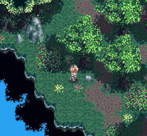
Warp is a puzzle-based stealth action game where you play as Zero, a little orange alien with a big score to settle!

I copied that off the game's website.

The important part is in the first five words. Warp is puzzle-based. That's how the game is billed, that's what I expected.
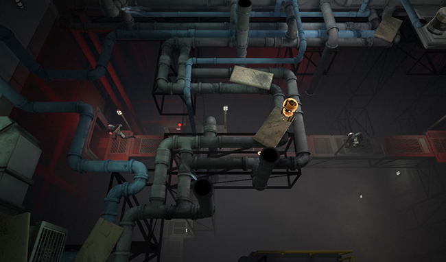
And let's get this out of the way: Warp is a good game. The puzzles are fun, the game is pretty, the plot is predictable but in the good we're-all-familiar-with-this-myth-so-let's-get-the-cliches-out-of-the-way-and-have-some-puzzle-fun manner. I like myths. Myths are good. Myths attached to a puzzle game are even better.

Zero, the playable character, has a host of special abilities. He can warp through solid walls and obstructions, he can warp inside objects and explode them from the inside, he can swap places with objects and he can launch objects at high speed. Note that "objects" includes "people". In most puzzle games, "people" are major puzzle pieces. In Warp, the only real difference between a turret and a person is that the person is easier to lure into important locations and doesn't shoot you as quickly.

It's all a recipe for a great puzzle game, and it's honestly somewhat tragic that it falls short.

The thing about good puzzle games is that, by their very nature, you'll have trouble with them. Some puzzle games are designed so that it's impossible to get stuck. Some are designed so that restarting is easy and fast. Warp is a bit of a curious beast in that it's also a stealth action game. Your opponents have guns, they are quick with their triggers, and you will die in a single shot. So: You die. You hit the "restart" button.
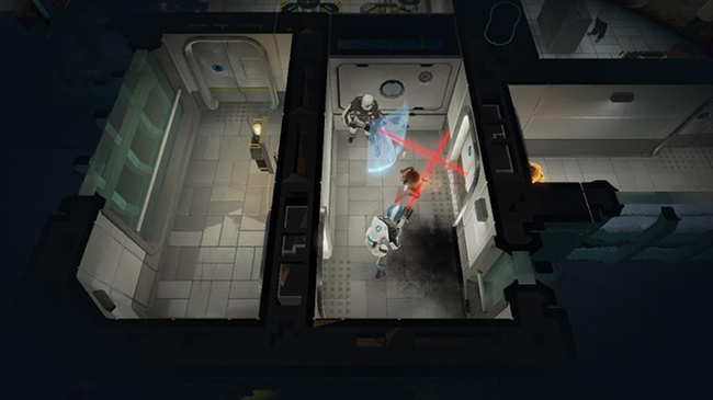
You sit there staring at a loading screen for ten seconds.

Which doesn't sound like a lot, but Warp is a very deadly game. The wrong approach can, and will, lead to death in seconds. Even when you're not being actively shot at, the world is littered with lasers and explosives and similar instant death traps. The second level starts with a puzzle that will kill you so quickly that failure results in spending more time loading than playing. And even when your plan is perfect and the area is harmless, Warp's sensitive controls will lead to you waltzing into lasers and warping yourself straight into death far more often than you'd expect.

Each time, accompanied by a ten second loading screen.

It is hard to describe how annoying that is, and it's just a herald of what lies in store.

Warp is filled with minor issues. Nothing that, in itself, would cripple the game. Things that I'd normally be remarking about in passing, as a minor blemish on an otherwise good game. But they just came so quickly and so relentlessly that it seemed every time I forgot about one, I'd run into another.

Example: The levels are filled, not just with armed guards, but with unarmed scientists. The scientists are terrified of you. Perpetually. Doesn't matter if you've carefully avoid killing scientists. Every time you warp into a room: screaming scientists. You can stand in the room for a minute and they just keep running around panicking, you leave the room, they recover and go back to work, teleport back in and it's Screamtown USA all over again.
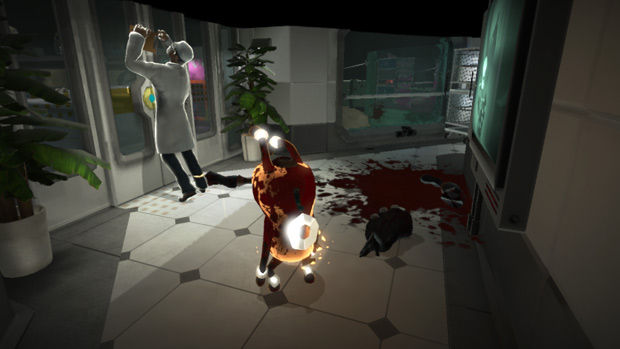
This could have been improved in several ways. Iji does it brilliantly – avoiding slaughter in Iji eventually leads to the "enemies" allying with you, followed by an entire different branch of the game with a different ending. Extra endings and game branches take time and money, of course. Here's an easier idea: make the damn scientists quieter. As it is, every time you jump into a room you're greeted with an atmosphere-obliterating chorus of screeches. Or make them stop paying attention to you after a while! Maybe that's a reward for not killing them: they stop setting off alarms!

Another example: I mentioned Warp's controls. Most of my frustration revolved around Zero's Illusion ability, which allow him to project a duplicate of himself to trick enemies. The problem is that any damage done to the illusion, or any missteps into areas where the illusion is not allowed to go, will dissipate the illusion . . . causing Zero to instantly start moving in whatever direction the illusion was moving. If you use the illusion in a place where it's not allowed – even if a valid spawn point is literal inches away – the illusion will spawn directly in front of Zero, instantly disperse, and return control to Zero when you're least expecting it.

So if, for example, you decide to create an illusion and move it forward, and at that very instant a laser beam fires directly ahead of you, your illusion will walk into it, disperse, and before you have time to react, Zero will troop happily into it and die.

Cue ten-second load screen.

Not that this happened to me dozens of times over during the end boss fight or anything.
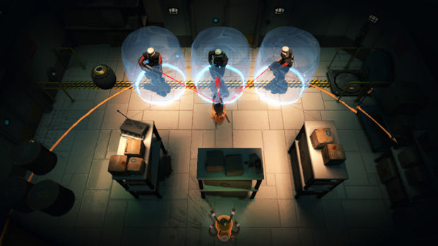
I can live with issues like this if the game is a low-budget affair, and doubly so if they're easy to recover from. Hotline Miami, an even faster-paced game released lately, is buggy as hell and had many fascinating problems and glitches as I fought my way through the levels. But in Hotline Miami, restarting the level is instant. And Hotline Miami's art is relatively simple, and its budget, I suspect, was quite minimal. For an indie game, Warp is a high-budget game, built on the Unreal engine, with detailed 3d models, good texturing, copious voice acting and cutscenes, and a boss that randomly and mysteriously fails to take damage from being attacked. Given the money spent on the rest of the game, the controls, loading times, and gameplay bugs are just unacceptable.

In the end, I kept feeling like the actual game had taken second tier to the rest of Warp. Compared to the amount of polish the art and atmosphere received, the gameplay was rough and spiky.

Warp is a good game. But with a little more work on the interface and a little more work on the game behavior, it could have been a lot better . . . even if that meant sacrificing a bunch of polygons.

A few weeks ago I ran into a Flash game called Lab of the Dead. I ended up getting far deeper into it than I'd expected, and the damn game wouldn't leave my brain. That's a good sign I should be talking about it.

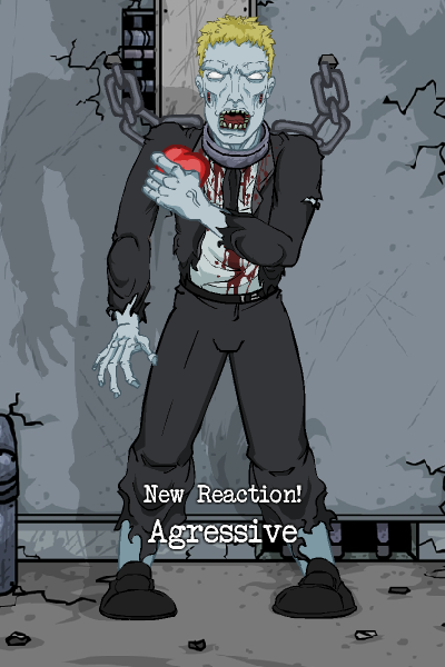
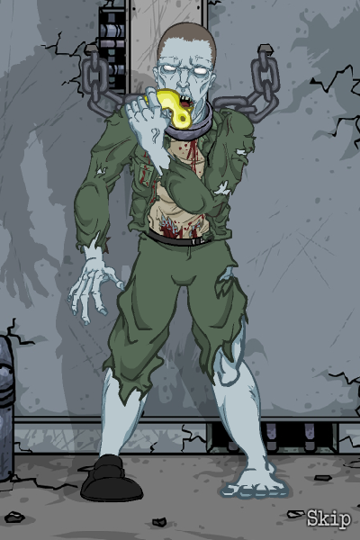
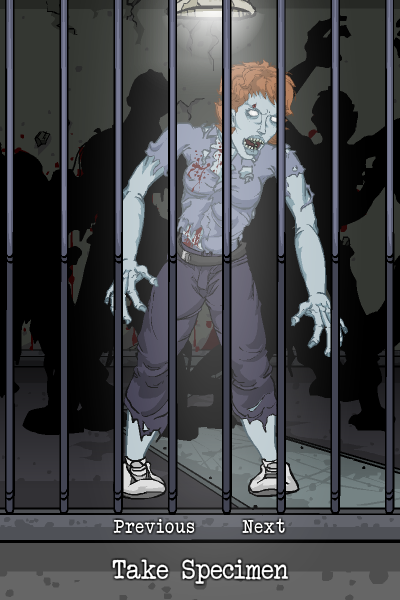
Lab of the Dead is one of those games that doesn't match any particular genre. You could call it a limited sandbox game, or a puzzle game, or a grind game, or a plot game – it's unclear. The game mechanics are simple. First, you pick a zombie to experiment on, which has almost no influence on the game besides what your test subject looks like. Then you subject the zombie to various items, including anything from shooting it with machine guns, throwing eggs at its face, letting it eat a dead cat, or putting a pair of headphones on it and playing rock music. Depending on the emotional state of the zombie (measured on three scales – "aggression", "hunger", and "humanity"), these various items will result in one of three basic reactions, with a fourth Advanced Reaction that can also depend on what previous reactions the zombie has experienced.

In order to progress the plot, you must experiment on the zombie a certain number of times and discover a certain number of reactions. Progressing the plot unlocks more items that you can use for future experiments. Importantly, there's no way to lose – one could eventually beat the game by clicking randomly.

The most crucial part of the above, however, is that "emotional state" thing I mentioned. Every interaction with your zombie will affect two or three of those scales. Perhaps a squeaky toy will increase their Humanity and reduce their Aggression, perhaps feeding them a dead rat will reduce their Humanity as well as their Hunger. Since the game is gated based on the number of unique reactions you've seen, and since you need to change the scales in order to unlock more reactions, you'll be spending a reasonable amount of your game time trying to do things like increasing your zombie's humanity, or decreasing their aggression, or starving them so they'll attempt to eat a book.

All the reactions have custom animations with appropriately themed behavior. The mid-aggression Live Cat response might result in the zombie attempting to bite the cat. The high-aggression response may have the zombie straight-up disembowel the cat, while the low-aggression zombie may actually pet the cat a few times before the cat runs away. All of this comes coupled with appropriate music and sound effects – I mean, sure, it's still a zombie, but an aggressive zombie's growls tend to be a lot more furious than a passive zombie.

The end result is that you're sitting there spending 15-30 minutes at a time to train a zombie how to pet a cat. No, no, stop eating that mouse, look, let me show you a squeaky duck! See? How about listening to some music, are you feeling better now? Oh, you're getting hungry? Here's some meat I found down in the kitchen.

For a zombie game, it's a surprisingly personal game. I said "you pick a zombie to experiment on, which has almost no influence on the game besides what your test subject looks like," but let's be honest, that's actually a pretty major choice. Your options include half-rotted horrors, schoolgirls, average Joes, you name it. The "choice" segment really immerses you in the zombie's welfare, because out of a whole ton of zombies, you explicitly chose that one. The game's design aims quite directly at establishing an emotional connection between you and your test subject.

Which makes some of the game quite horrifying.

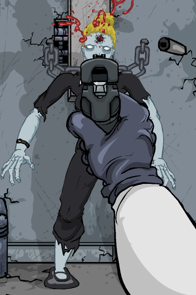
Because, remember, this is – in the end – a test subject. A zombie test subject. And for all that you may want to test the various toys and games you have available, there are also other, less fun items available. Knives. A machete. A shotgun. Grenades. And these items, as well, have to be tested extensively.

You know what happens when you shoot a zombie in the head with a shotgun?

It dies.

And when that's a zombie you've been carefully tending for half an hour, when you've taught that zombie how to play with a Barbie doll and a big stuffed bear, and when you are the one who has to scientifically determine what happens when you systematically fire a pistol into each of its limbs, its torso, and then its head . . .

. . . well, it's kind of a painful game.

Doubly so because of how little the game seems to care about your zombie's death. The main character sighs dramatically about needing another test subject and then it drops you right back at the "choose a zombie" screen. Pick a new test subject and the tests continue. The game considers the zombies completely inhuman, but I found that resulted in me being more aware of their humanity.

I'm definitely not the only one who felt this way. The top comment on Kongregate as of this writing, with a score of over 3000, is asking for the ability to switch zombies without killing your current specimen. I've seen the same suggestion in many other places. And yet, I think providing that would lose a large part of the game's beauty. The game, in its current state, *forces* you to destroy something that you've spent time on, and something that you've acquired history with, for the sake of a nebulous ill-defined long-term goal. The very fact that people are asking so loudly for the ability to switch zombies is, perhaps, a good indication that that ability should not be provided.

One of the things games do badly, and should be working on doing better, is emotional connection. It's a very rare game that leaves you personally invested in the welfare of the characters. I'll admit I hadn't expected to encounter that in a Flash game about experimenting on zombies, but I did, and I'd strongly recommend checking the game out and seeing what makes it emotionally tick.

This is going to be a tough post to write.

See, most of my dissections take the form "look, this is an excellent game, it is a lot of fun, let's talk about what it did wrong". Some of them are "I'm not sure what this is, but it's worth talking about".

For the first time, I want to talk about a game I flat-out didn't like.

You're not supposed to do this as a game developer. You're especially not supposed to do this as an independent game developer while talking about an independent game, and I feel sort of bad about it. But we're doing it anyway because I have an important point to make.

Now, before we continue, a bit of a disclaimer. Game preferences are very subjective. The fact that I don't like the game does not, in any sense, mean that the game is bad. Also, I wouldn't bother writing about the game if I thought it was awful. I had a lot of hopes for it, and it almost works for me, it just shoots itself in the foot after about two levels.

So let's talk about Dwarfs!?. And, no, I'm not going to keep including the punctuation.

Dwarfs places you in command of a town hall and a squadron of dwarves. The dwarves are mostly autonomous, mining semi-randomly in every direction. As they mine, they produce gold, which goes straight into your coffers. You can command dwarves to mine in specific directions, aiming them at caches of rare minerals and gems, but that costs the very same money they'd be mining for you, so it's a bit of a tradeoff.

The problem with autonomous mining dwarves is that they may mine in directions you don't want. The game field includes several unidentified caverns, which may be empty or contain gold. Worse, they might contain water or lava. Water spreads in all directions, drowns dwarves, and will eventually destroy your town hall if you permit it. Your only hope is to stop the water with a temporary wall (costs money), surround the dangerous cavern with unbreakable walls (which can be placed only on intact areas of the cave, and cost money), and then use explosives to create bottomless pits at every choke point before your dwarves blindly mine through the temporary wall again and release the flood. The explosives, unsurprisingly, cost money.

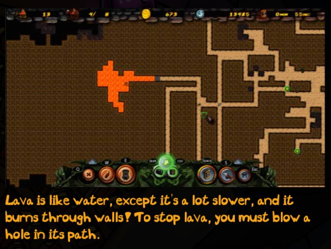
Lava works the same way, except it doesn't spread as quickly and it slowly burns through temporary walls.

Monsters will happily kill off your dwarven workers. For a fee, you can recruit dwarven warriors at your town hall, then give them instructions to go fight the monsters. You can also build outposts which allow warrior recruiting, allow mining dwarf recruiting, allow warrior training, and have a big cannon on the roof so you can launch your warriors around the map rapidly.

I've just described the entire game.

No, seriously. That's it. The whole thing. You've got one command you can give your dwarves ("move here"), four ways to interact with the world ("solidify", "explosive", "temporary wall", "build outpost"), and five outpost commands ("recruit workers", "recruit warriors", "train warriors", "launch warriors", "retrieve warriors").

Now, I don't mind minimalistic games. But they need to either polish that minimalistic game mechanic to a mirror shine (Canabalt), ensure that all the "simple" game mechanics interact in complicated ways (Desktop Dungeons), or create varied and well-designed game levels for those simple mechanics to interact with (Super Mario Bros. 3, which was admittedly not minimalistic by the standards then, but sort of is now).

Dwarfs, unfortunately, does none of these. It feels empty and cluttered, simultaneously. As I was playing, I kept running into these difficult questions that I had no good answer for. Why are there both lava and water, when they behave so similarly? Why do dwarves have levels? Why does dynamite require a dwarf to trigger it? Why are there travel instructions that tunnel through walls, but no way to say "travel to this destination as fast as possible, don't bother tunneling unless you have to"? Many of these features feel less like gameplay mechanics and more like click consumers.

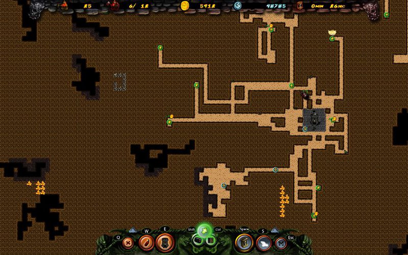
Which is what I was mulling over until I ran into this level:

And suddenly it all made sense.

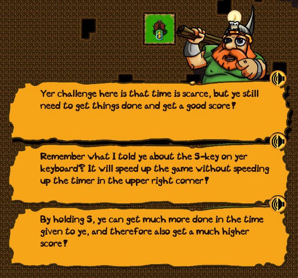
Dwarfs isn't a strategy game, and it's not a tactics game. Dwarfs is a micromanagement game. All those mechanics that I called "click consumers"? That's exactly what they are! The game isn't about optimizing the movement of your dwarves, or building a cave structure, or building an army. The game is about making as many points as possible in the shortest period of time as possible. Optimal play means speeding up the game as much as possible, and only slowing it down when doing otherwise would cause you to lose. Practice, in this game, is maybe one third strategy, and two thirds simply clicking faster.

Now, again, this isn't necessarily a bad thing. This is similar to why I don't play Starcraft II and I'm never, ever going to claim that Starcraft II is a bad game.

But I also don't think it makes for good gameplay. If the difficulty is in micromanagement, then the player is left playing the interface. Take Dwarfs, and add a "route automatically through tunnels" option, and the game gets easier. Add a "automatically dispatch dwarf to trigger dynamite" feature, and the game, again, gets easier. Take Civilization and add whatever pure UI change you want and the game is left unchanged. When I'm playing a game, I want to play the game, not the UI, and Dwarfs is all about playing the UI.

If you look through the campaign levels, this becomes increasingly obvious. The game contain a tutorial plus five "campaign" levels. The tutorial is about what you'd expect (and is admittedly well-done), but the campaign starts gimmicky and ends gimmicky.

In order:

To Battle!: Defeat a number of enemies with a small squad of warriors. There's no standard mining in this battle, it's solely about choosing the right group of enemies to fight next, with a bit of micromanagement if you want the best result.

Castastrophe: You start on a map with at least a dozen pools of water and lava about to be breached. Survive for several minutes. Again, there's no standard mining, it's just learning to very quickly deal with all the mining disasters.

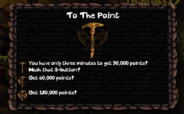
To The Point: The screenshots provided above. Get a number of points within a strict time limit.

The More The…: Create a large number of dwarves within a strict time limit. Again, this comes down to "hold the speed button as much as you can", with a slight emphasis on building outposts (which you can avoid in earlier levels.)

Godspeed: Survive for several minutes with a Speed button that is never released.

None of these missions introduce significant new mechanics. The first two are gimmicks where a large chunk of the gameplay mechanics are removed, without any new gameplay mechanics added. The latter three are "play the game quickly", and aside from a slight difference in scoring on "The More The…", are essentially "hey, go play the game".

The game also includes a handful of variant modes. Rush Mode, in which dwarves spawn faster. Dark Mode, in which the board is blacked out and you can only see where you've dug. Sandbox, where you can create cave layouts and spawn monsters and dwarves at will. And, finally, a Tower Defense mode. Now, to me, these feel like old development experiments and tools, not fleshed-out game features. The "Sound Test" of modern games.

Sometimes, I complain about games because I don't think they figured out what they wanted to be. I don't think that's what happened to Dwarfs. I think the real issue with Dwarfs is that they had a game in mind, and they made the game, and then instead of polishing their base gameplay to a mirror finish, they threw in a bunch of other features for the people who didn't like their base game mechanics.

And while many may like those game mechanics . . . I will admit that I don't, and the rest of the game doesn't save it for me.

I'll be watching for the next thing the developers do, because it's clear they're skilled, but I'm not going to be playing any more Dwarfs.

Been awhile since we've had one of these, eh? Let's get some images, too. Images that aren't screencaps of my own games.

Oh man that's so much better.

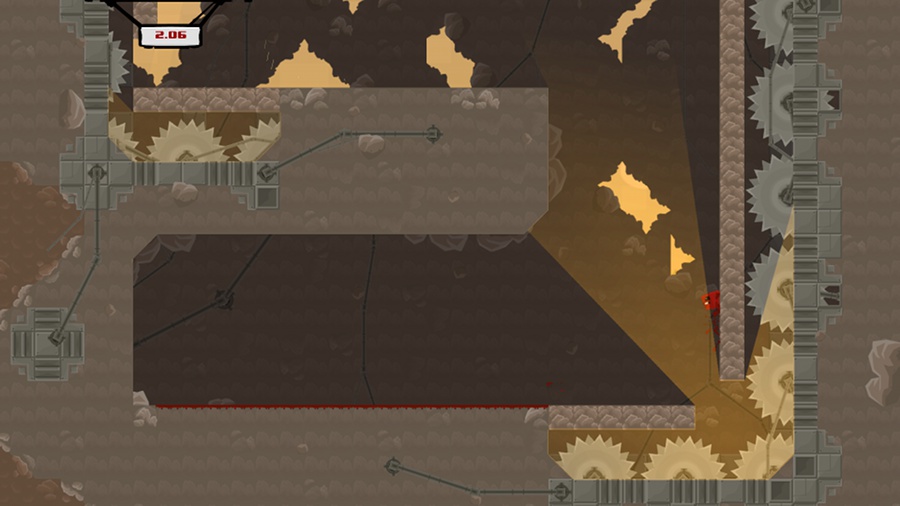
Super Meat Boy is a truly fantastic indie platformer that came out a few months ago. It's available here, though if you haven't played it by now, it may not be your cup of tea.

You see, Super Meat Boy is hard. Hair-tearingly soul-crushingly ridiculously hard. It is one of the harder games that's come out in the last decade or so. What happened a decade ago? We learned that games should probably be possible.

It might not seem like we had to learn that, but, trust me, we did. For a long period of time, games weren't meant to be possible, they were meant to eat your quarters forever. The more quarters you could convince someone to feed into your arcade machine, the more money you made. This culminated with a rather notorious boss in the Dungeons and Dragons arcade machine that would literally take no damage until you'd put in twenty quarters. That's right: you have to pay five bucks to start killing the boss. Eventually games moved on to consoles and computers, and people stopped having to feed quarters in, and eventually we realized, hey, why not make games have an end? Then it turned out that if you spent a lot of money putting an ending in your game, maybe it was a good idea to, like, let people see it, and so games got a lot easier in the space of a few years.

Some people miss that.

Team Meat missed that.

So they made Super Meat Boy.

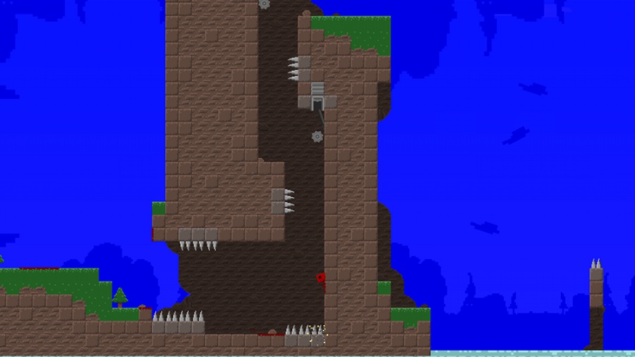
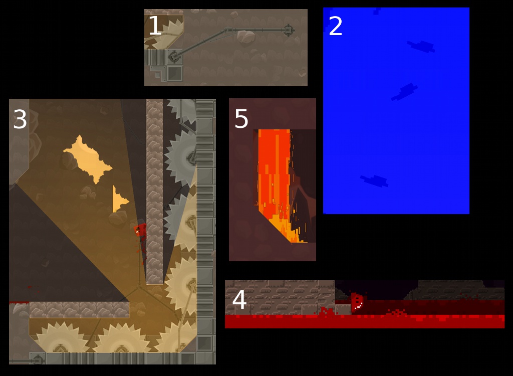
Super Meat Boy is a throwback in a lot of ways. First, in terms of its difficulty. But most obviously, its art style. It could be described as "relentlessly retro" – the game is firmly grid-based, the pixels are large and chunky, everything about it says "this is a retro game".

And some parts scream retro. Limited palettes, small assortments of tiles, even less bending of the grid formula. There's slopes in the previous two pictures. There's no slopes here. We don't need slopes. We've got blocks.

What I find most fascinating about Super Meat Boy's art is that it's far, far, far more complex than anything you could do on . . . say . . . a Super Nintendo. Deceptively so. Super Meat Boy's art isn't 16-bit art. It's modern, hardware-accelerated DirectX graphics . . . carefully crafted to be strongly reminiscent of old game consoles, while not actually being old game console art. And curiously, it takes on several "16-bit conventions" that didn't actually exist back in the 16-bit world.

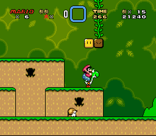
Take a look at an actual 16-bit game, Super Mario World. (In the series Super Mario Brothers. You may notice that Super Meat Boy has the same initials. I would be shocked if this were a coincidence.) Look at what's going on this screeenshot: rounded corners everywhere. The platforms have rounded edges, the blocks are rounded squares. None of that translates into the actual game physics – every ledge behaves like it's a sharp 90 degree angle, the rounding is just there to give it some fancy looks. The floor, and the platforms, have some art going on to give them a little more depth. The background has coloring designed to fake you into thinking it has a lot of depth. Bushes in "front" are darker, bushes in "back" are lighter, and it's all fluffy to make it hard to recognize the tile boundaries.

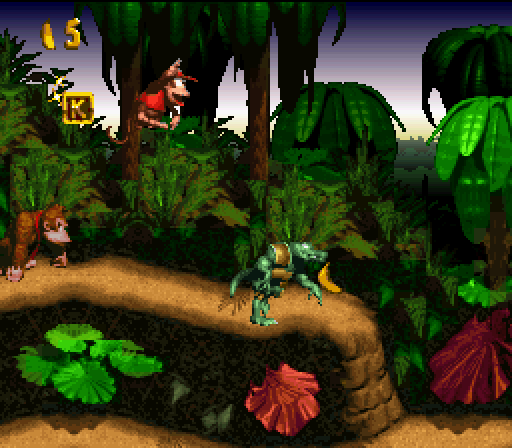
Two more: Donkey Kong Country and Tales of Phantasia. Look at DKC, first. See just how impenetrable the actual level layout is. There's all kinds of crazy fake-perspective and cleverness going on here – you can't even see the underlying grid. This game makes great use of parallax – as you run, the backgrounds scroll at a different rate, to give an impression of depth.

Tales of Phantasia doesn't do as good a job of hiding the grid, but look at how many tricks they're using to make it still look great. Fake 3d, shadows, objects that don't conform to the grid quite like you'd expect. The grid still exists, but the collision layer doesn't conform directly to it – the collision layer is more complex so they can make rough edges. The grid is still there, they just try to hide it. It's all smoke and mirrors.

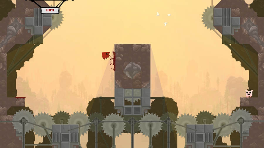
Super Meat Boy dispenses with the smoke and mirrors. Platforms have hard edges. There's no fake lighting effects on the platforms themselves, just splashes of red where you walked (Super Meat Boy is a boy who has no skin, and as such, he leaves blood everywhere.) There's often multiple layers of background, as you can see in the first image, but there is a hard divide between the "background layers" on the same plane as Super Meat Boy and the background layers deep, deep behind him. The same-plane background scrolls at the same rate as Super Meat Boy does. The deep background layers are much, much, much slower, giving an illusion of depth with no risk of confusion.

The real 16-bit games did everything they could to escape their 16-bit nature. They pulled every graphical trick and programming trick they could. The modern "16-bit" games revel in it. The sharp corners are emphasized instead of hidden. The backgrounds are set apart from the foregrounds.

It's not about immersion, because if they wanted immersion, they wouldn't be making a 16-bit game. It's about a feel and a concept.

The funny part is when they start using techniques that the "16-bit" games couldn't use in the first place.

1: Take a look at the left side of that pipe. You see the tricky thing?

It's rotated.

The Super Nintendo couldn't do that. The Nintendo absolutely couldn't. Easy use of rotation only showed up as of the PSX era, deep into the realism push.

(Okay, the Super Nintendo sort of could, but only one layer out of its 4. It certainly couldn't rotate multiple things independently unless you had a cartridge with special rendering hardware, like Starfox or Yoshi's Island.)

2: The contrast is a little tricky here, but this comes from the third screenshot up above. It's the same deal as #1: rotated clouds. These clouds zip around the level wildly while you're playing. That's not a 16-bit effect, that's a modern hardware accelerator. Can't fool me!

3: Super Meat Boy has some really wonderful lighting effects. In this case, the pit below Meat Boy is emitting light, which is pouring up through the hole and illuminating everything. Again, this is the kind of thing that the classic consoles just couldn't do. Light compositing takes some moderately hefty hardware, and transparencies only showed up in the Super Nintendo era. In this case it's actually even worse than you'd think. The crumbly-looking blocks that Meat Boy is gripping will actually disintegrate after a second or two of being touched, and the lighting effects adjust instantly. That sort of complex lighting is well out of reach of 16-bit consoles, but because it can be easily applied to "16-bit" worlds, and because it looks really quite awesome, it's common in games like this. See Gish for more examples of this lighting style.

(Also not a coincidence – Gish and Super Meat Boy share a substantial portion of their development staff.)

4: You never see old games intentionally making the world blockier than necessary. They do everything they can to make it less blocky. But take a look at this lava – it's obviously and intentionally chunkier than the rest of the level. Big pixels, about twice as large as the pixels on the solid objects, and they're not even grid-aligned. That's not done for the sake of the hardware. That's a pure stylistic choice.

But if you want a really ridiculous example . . .

5: These pixels aren't even square! Look at them! They're ridiculously tall! And I don't even know what's going on with the pixel sizing. On the edge there's tiny, tiny pixels. In the middle there's big chunky pixels. In the fire, there's pixels of all shapes and sizes, glomped together into a flame effect that looks distinctly old-school while having absolutely nothing in common with old-school platform limitations.

The fact that it's sitting on top of a beautiful and completely non-SNES 45 degree angle is just the crowning touch.

Next time you're playing a fake classic game, look at all the tricks they're using to show you how old the game is meant to look. Next time you're playing a real classic game, look at all the tricks they're using to pretend the game has more detail and beauty than it actually does.

This was meant to be one entry. "Oh, but Zorba, it is one entry!" No it's not. You just haven't seen the second part yet. This will be continued.

God of War Dissection: Myth and Story

2009, January 22nd 5:58 PM

I'm afraid I've lied to you all.

In a previous entry I explained in depth why game worlds need to make sense – not just in terms of Game, but in terms of World. I claimed that your world needed to be consistent, to feel like a living, breathing, realistic location, not like it was summoned out of the ether to provide a backdrop for a half-naked Greek dude to violently slaughter things.

This is actually a load of horse hockey.

But it's important to realize when it's a load of horse hockey.

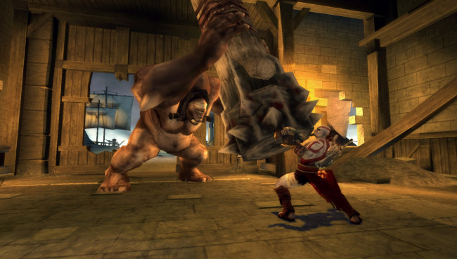
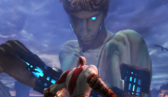
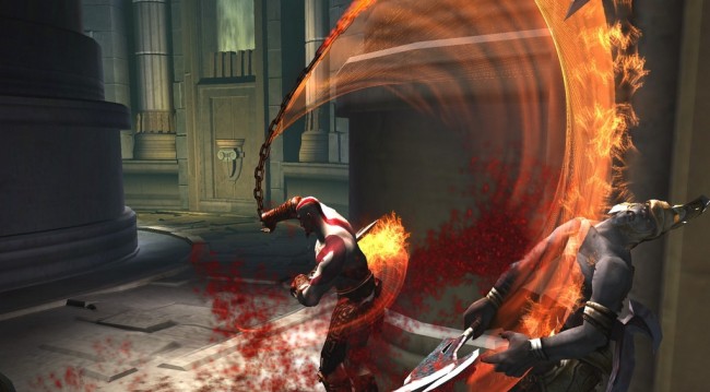
God of War. It's one of the more successful recent franchises. God of War 1 was a Playstation 2 game, in which you played Kratos, a half-naked Greek dude who violently slaughtered things. I'm going to assume I don't need to continue the joke here – you can probably figure out what God of War 2, God of War: Chains of Olympus, God of War: Betrayal, and the upcoming God of War 3 are about.

The important thing to realize about the God of War series, which sets it about as far away from Dead Space as is possible for it to be set, is that God of War is a myth. It's not about some average-Joe engineer, thrust into a terrifying situation against his will. It's about a living legend. Kratos, the Ghost of Sparta. Kratos, the Hand of the Gods. Kratos, the God of War. Kratos is the main character in a world which fundamentally revolves around him – he is Revenge, he is Fate, he is Destruction.

On top of that, Kratos is the main character in a game that is, itself, fundamentally about fate and gods. Scratch that – fundamentally about Fate and Gods. Both of those tend to bend the laws of probability around them. Unlikely things become expected when prophecy is involved. When Kratos makes his way through a half-destroyed forest of columns, swinging from one to another as they topple around him, we don't think "ha ha, how silly, why were they all so precariously balanced in the first place, this game sucks" – we think "this is a test, we will vanquish the test and fulfill our destiny". When you realize that half of the puzzles involve destroying large blocks of stone, thereby proving that the puzzle has never before in the history of the universe been solved, and that some of them actually rely on certain parts of the puzzle being age-worn and easily shatterable, we don't think "ha ha, are we seriously expected to believe that Kratos was the first one here?" – we think "see how everything falls into place! Truly, we are the chosen one, and we cannot be stopped!"

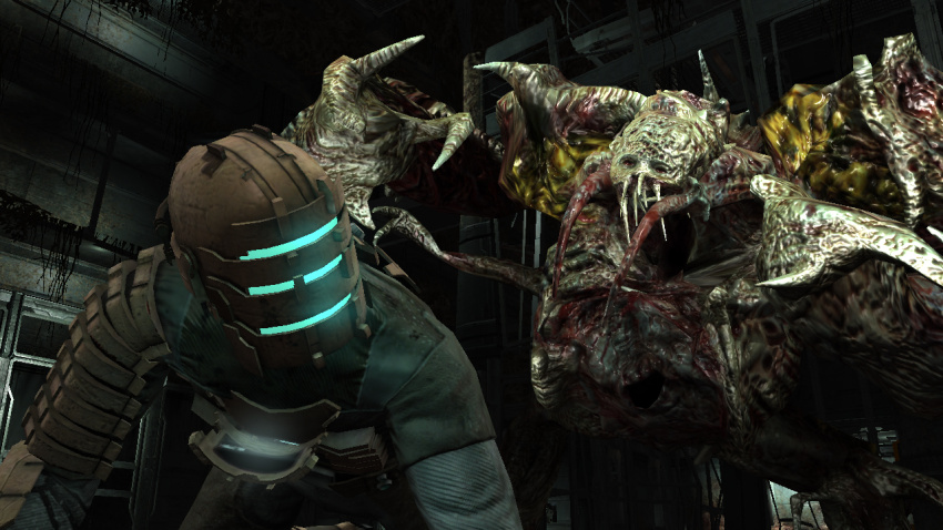
This wouldn't work in Dead Space. Dead Space is not a myth – Dead Space is a story. Isaac isn't a Chosen One. Isaac is an unfortunate man in an unfortunate situation. The world does not care if Isaac lives or dies – Isaac can be shredded by industrial machinery, or devoured by zombies, or simply freeze to a cold lonely death in space, and fundamentally, nobody in that game will care (besides, obviously, Isaac.) Isaac isn't being pushed through by the Forces of Fate, there is no greater being controlling his actions – he's just a guy, trying to survive.

And this, incidentally, is one of the curious things about Star Wars. Star Wars is a myth about a random guy. On one hand, it is a myth – Luke Skywalker is the Chosen One. But on the other hand, Luke Skywalker is just some backwards hick from Tatooine. Most of the time, Star Wars feels like a story about some poor teenage dude who's way, way, way in over his head. Luke gets his hand cut off. Han gets frozen in carbonite. Luke gets beat up. Luke gets dropped into a fighter cockpit and told "we're all counting on you!" and, holy shit, they're all counting on him! Even when Luke is being ridiculously badass and slaughtering dozens of stormtroopers, you kind of get the feeling he's not quite sure what he's doing here.

And then he ends up in the Emperor's quarters, and everything shifts a little . . . and suddenly it's not a story about Luke Skywalker, Desert Farmer, it's a myth about Luke Skywalker, Jedi Knight, and oh hey lookit that, there's a reactor vent in just the right spot. What a coincidence! Almost as if it were fated to happen.

I'm not entirely convinced that shift was intentional. I think it was a lucky accident, and that the writers never sat down and said "okay, and here we change from story into myth". I think they just wanted to throw the Emperor into a reactor core. If anything, this is what I want people to get out of this:

Myth is good. Story is good. But you have to understand which form you're writing, and why.

And for bonus credit:

Arguably, I lied to you again. Sorry. Figure out where, and explain why it doesn't matter. (You'll need to know one of the two games I talked about in order to do so.) I'll post more about this later.

Games, movies, and magic have one major thing in common – misdirection. Show people one thing, then indicate to them that they saw another, and usually they'll believe you. In magic, it's harder because they're trying to figure out what you're doing while you're doing it. In movies, it's easier because the person is really just going along for the ride. In games, it's really easy, because the player is being assaulted by zombies and doesn't have any attention to spare.

At least, they don't the first time they play the game.

The second time, they're probably paying a lot more attention to what's going on around them. The zombies attacking, yeah, sure, they're a problem – but we've dealt with them before. Let's look at the other things around us!

This is when they discover how careful the game is at showing you exactly what they want you to see, and keeping you from doing anything besides what you're supposed to.

Not supposed to go through a door yet? It's locked. Got a cutscene to watch? I can guarantee every door leaving that room is locked – even if you just came through it ten seconds earlier. You can walk through a door, have it lock behind you, and then have the very same door unlock the instant you're done with a cutscene or a movie. Happens all the time.

Sometimes they even force you to look in certain directions. Sometimes, this is to make you look at something you're supposed to see. Sometimes, this is to make you look away from something you're not supposed to see. In the first level, there's an exploding shuttle. I bet you remember seeing it explode, right? It was really cool? No! You didn't. Because you can't have. The camera is jerked away from it at the last second, and when you turn back to it, it's already exploded. You're carefully prevented from seeing the exact moment it explodes.

The reason for that, of course, is that animating something large exploding in a realistic manner is expensive and hard. It's easier to just not show it. And it works great . . . up until the person realizes what's going on and decides to try exploring the boundaries.

This is a common issue in games. There are a good number of games out there that pretend you're given choices, but actually prevent all choice. The Half-Life 2 series is a perfect example – the first time you play it feels like an exploration, but every time after that you realize, hey, wait, I'm not allowed to go anywhere else! That exploration feeling was a ripoff!

I should mention that this is not necessarily a bad thing. The fact is that most people will never start a second playthrough – in fact, many people won't even finish the first. It's arguably kind of silly to triple your budget by making content that 95% of your users will never even see. (It's also arguably not. I'll post an entry about this someday.) But it does mean that going through the game a second time is kind of like being invited backstage at a live performance, or having the magician explain his tricks – all those cute things you noticed the first time turn out to be your own fevered imagination running a bit too fast.

Solution? There isn't one, besides solving the hard AI problem and writing programs that can generate content for us. Unfortunately, this is a ways off, and if we ever do solve it, we've put ourselves out of a job.

All I can say is: be aware of it, and try hard to keep the player from feeling constrained. At least, on the first playthrough.

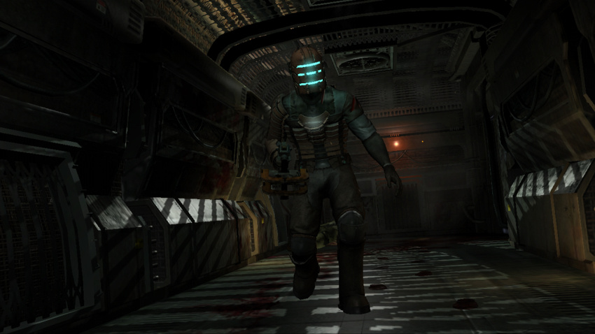
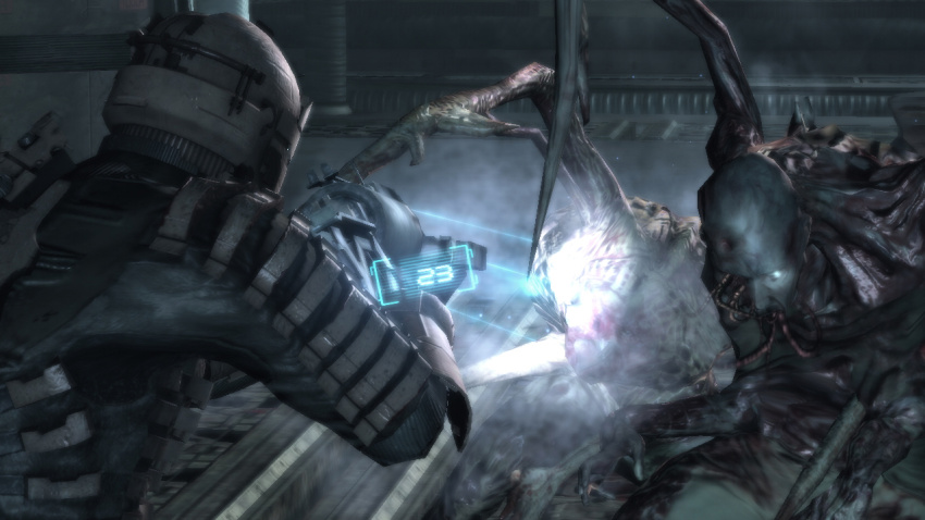
Dead Space takes place on board the the USG Ishimura, a colossal "Planet Cracker"-class mining ship. It's a ship designed to literally rip apart planets to feast on the tasty, tasty ore inside. The ship's architecture varies from tight constricted maintenance corridors to huge open industrial spaces. At various points you visit the hydroponics bay, personal quarters, the medical bay, the bridge, and pretty much the entire set of possible important ship locations.

Most of the places you travel make sense in context of the ship's purpose. There's equipment suitable for its purpose, the layout is at least plausible, the lighting looks like it would be acceptable before zombies smashed up the place, etc. Some of the places do not make such sense. The ship is weirdly infested with inexplicable circuitous corridors. There are industrial areas that can best be described as mazes of walls. Why is there a maze in this ship? Did the crewmen just want a maze in their ship? There are strangely-placed high-speed trams that lead from one near-dead-end to another (the asteroid cannon being the most notable WTF moment). Why isn't, you know, there just a door which is closer? Are you seriously saying there aren't any other corridors within a kilometer? Overall, a good chunk of the ship just plain doesn't make sense.

Now, if the ship were designed by zombies – yeah, sure, go for it, zombies are crazy, who knows how they'd design it. But they aren't. It was designed by people. And when you're told that you're walking throughout a human-designed spaceship, and 3/4 of the ship makes perfect logical sense, those moments when you find yourself thinking "wait, why does this area even exist?" are painfully jarring. Why does this maze exist? Well, it exists because the game plans called for a maze, and by gum, we're putting a maze in!

What's the fix?

The only fix I can think of is to be excruciatingly careful that each location makes perfect sense, both for the game and in the context of the universe. It's hard, it's really hard, but I think it's important. This isn't an issue that's restricted to games – it's something movies get constantly wrong as well (please, explain to me why the Emperor's chamber on board the Death Star has a hole leading directly to the reactor core without even a guard rail) – but that's not an excuse, it just means we get more people to laugh at when we finally get good enough to avoid it.

For each zone, for each object in the game, you have to answer two questions. Why does the game contain this? Why does the world contain this?

If you can't come up with good answers to both questions, get rid of it.

Traditional game animation is (mostly) pregenerated. An animator sits at a computer and carefully poses the motion of each limb. Eventually, you have a spider that crawls across the ceiling and shoots acid in your face. Done!

In motion, this looks pretty good. In death, it's problematic. First, unless you've gone to the trouble of multiple death animations, creatures always die the same way. If you kill five hundred Basic Guards, you'll end up with five hundred identically-posed corpses lying around. Uncool. Second, death animations have nothing to do with the weapon you kill them with. Poke them a thousand times with a needle? He'll scream, fall over, and lie with his face on the ground. Shoot him with a portable nuclear warhead launcher? He'll scream, fall over, and lie with his face on the ground. Uncool. Third, death animations tend to "snap" from other animations. Basic guard takes a flying leap, jumps at you, you kill him midair . . . and suddenly he plays the Death Animation, which involves him instantly standing up in midair, then screaming, falling over, and lying with his face on an imaginary ground, while his corpse eventually falls into a pit. Uncool.

There's a solution to this. Games have gotten sophisticated enough that most modern 3d games include a basic physics engine. You don't need perfect physics for this, something simple is pretty effective. Animations are already based on a simple skeletal model – arms have two "bones", legs also have two "bones", etc – and it's easy enough to allow these bones to just move via the laws of inertia and behave properly on impact.

So you kill someone on a tower of boxes, his corpse will tumble down the boxes. You shoot someone with an air cannon while he's standing in front of a railing, he'll backflip over the railing. Rocket launcher to the feet? Flying guard corpse! Cool.

There's problems. (Of course there's problems. You think I'd be writing about it if it really were that simple?)

Ragdolls tend to be used only for actual death. It's just too hard to recover from a ragdoll collapse if the creature isn't actually dead. You knock a Basic Guard into a pile of boxes and he gets jackknifed between two – how does your Basic Guard recover from this? He doesn't, but now there's a living Basic Guard jammed uncomfortably into a pile of boxes. It doesn't work well. So ragdolls are only used for death.

But that introduces a new, irritating problem. Ragdolls can be used to detect death. Dead Space includes a gun that fires a shockwave which knocks things down. When knocked down, a lot of the zombies will cheerfully play dead, only to eviscerate you when you turn your back on them. However, it's trivial to determine if they're dead or not. See, when you knock them down, they always fall on their backs, with their legs facing you, and their left leg (from your perspective) slightly lower than their right leg. I know this very well from knocking down dozens and dozens of zombies this way.

When I see them fall down this way, I know they're just going to get up again in a few seconds. When I see them fall down any other way, I know the ragdoll mechanic kicked in, therefore I know they're dead, and therefore I can forget about them.

It's not very suspenseful.

I'm not sure what the solution is. It really is incredibly hard to recover smoothly from a ragdoll-based collapse. On the other hand, unless you have your artists make dozens of death animations, it'll always be easy to distinguish a "real" ragdoll death from a "fake" non-ragdoll death.

But it's a problem, and in a game like Dead Space, where detecting Proper Death is a very valuable skill, it's distracting like you wouldn't believe.

Dead Space is a fantastic, fantastic game.

Dead Space is a third-person science-fiction horror game. Your character exists. A large spaceship exists. A shitton of zombies exist. Mix and enjoy. Technically, other humans exist as well, but in terms of gameplay they're really only there for cutscenes.

There is you, and the ship, and zombies, with the zombies attacking you when you do not expect it and scaring the crap out of you. This is not Doom-style "a closet opens in the wall and a monster pops out, and you kill it, and you grab the health pack in the closet, and a second, smaller closet opens up and another monster pops out". This is "you hear a squeaking down the hallway and moving shadows, and you inch around the corner and finally see a bloody corpse hanging from its neck through a vent shaft, and then you turn around and something tries to claw off your face before vanishing through a hole in the floor. Also, there's clanging noises and screams coming from around you."

It's actually quite, quite creepy, and extraordinarily well-done. I quite recommend picking it up, assuming you enjoy playing scary things.

As anyone who's been reading this journal knows, this means I'm going to complain about it. That's just the way things seem to be going.

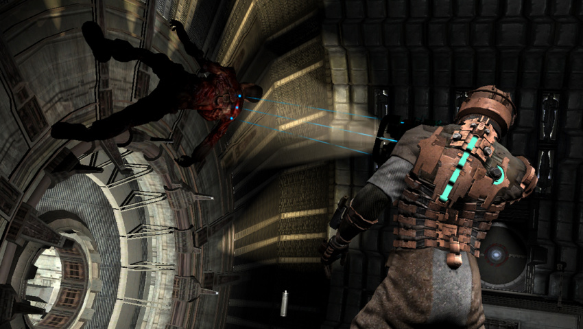
Dead Space is an immersive game. If you're "playing a game", zombies aren't going to scare you. If you're actually fighting your way through a derelict spacecraft, they are. One of the critical and most difficult parts to any immersive game is to not break immersion. This is hard. Very hard. Dead Space goes to extraordinary lengths not to do so. For example, there's no HUD in Dead Space. You can see your health by looking at your character's back (third-person, remember). Your inventory screen, and any windows or tooltips that pop up, do so via in-game holograms that exist in 3d space. Turn the camera and you can see the hologram from another angle. Monster jumps at you, and, well, it's not like the game pauses – now you've got a monster on your face with an inventory screen obscuring your vision. Good move, dude. Video cutscenes? Another hologram projection from your helmet. "Click here to pick this item up"? Another hologram projection, centered on the item. Everything – and I do mean absolutely everything – exists within 3d space in the game world.

Largely, it works. We, as game developers in general, have gotten better at this sort of thing. It's a constant battle, but one we're winning.

Mostly.

Dead Space has three problems that I've found. Three big, complicated problems, that deserve their own entries. So I'm giving them their own entries. Yeah, this is a series. So there'll be another post in a few days.

But I'll end this with a question:

What common, constantly-ignored immersion issues do you see in games? What common problem causes you to go "hey, wait! This isn't real!"

And how can it be fixed?

LocoRoco: Cocoreccho dissection

2008, July 27th 2:44 PM

LocoRoco: Cocoreccho

Developer: Sony

Completion level: Not even close

Spoilers: I'm not sure how this would be possible.


I just got a PS3.

What this means is that you may be bombarded with short dissections of short downloadable games. I might eventually make a post about the PS3 in general (summary: it's pretty dang awesome now and Microsoft's lunch is about to be eaten by Sony) but I may not.

The thing about small short games is that some of them are really really weird. Cocoreccho is an exception to this, mostly because I'm not entirely sure it's a game.

LocoRoco was originally a PSP game. You played the Earth, and tilted your surface to help a bunch of singing blobs defeat a small army of flying dreadlocked heads. I swear I am not making this up. If you think the gameplay sounds distinctive, the art style was even more so, consisting entirely of deformable solid-color 2d cutouts – on the PSP, no less, where most people were expecting gore and explosions. Add to that one of the most catchy and cheerful soundtracks I've heard in a long time (keep in mind your blobs sing along, with lipsynched animations, in chorus) and LocoRoco made Nintendo games look dull, stodgy, and moderately depressed.

It's a great game, and I highly recommend it. It's also a near-natural fit for the PS3's tilt sensor. All they had to do was port it over, add a bunch more levels, bam! Game!

What they actually made was, in the words of the lead developer, an "interactive screensaver".

You still have a large number of singing blobs (it wouldn't be a LocoRoco game without singing blobs) but instead of getting from one side of the linear level to another, you are instead exploring what can be best described as a humongous Thing. Its behavior will be familiar to anyone who's played the PSP game, as it includes spinny things, bouncy things, sloped things, things with holes, and every other joyous device that we're used to from the PSP game. Your goal is to move a magical butterfly around which attracts singing blobs, use that explore the Thing, find more singing blobs, and wake them up.

That's the game.

Unlike the PSP game, your little blobs have more autonomy than they did before. The Thing has several large "loops" of behavior in it, where the blobs will naturally wander down slops and jump into new areas with wind blowing them back up to the beginning, and your blobs will generally follow the loops on their own, meaning that even if you're not really paying attention they'll be wandering around the level without any help required. This is pretty dang neat – in many places you can just point the screen at a segment and let it sit while blobs fly through it. I'm pretty sure this is where the whole "interactive screensaver" part comes from.

Unfortunately, as a screensaver, it's a bit of a failure. You see, the screen itself doesn't move around. Wherever you leave it, that's what you're going to be looking at until you move it again. And while the blobs are largely self-motivating, the areas they travel through automatically aren't really particularly interesting. In order to make them do anything of interest, you have to not only control the butterfly manually, but you have to know where the interesting things are – making it impossible to just sit down and poke at it for a few minutes. Getting anywhere really interesting can easily take fifteen minutes to half an hour of work.

Which is a pity, because I think the idea of an interesting interactive screensaver that could be left on is a really cool one.

I'm going to diverge into philosophy here for a second. Games started as a thing that was Not Business. If you were using a computer for it, it was either Business or Games. It took quite a while for computers to be used seriously for any other sort of recreation (like reading blogs) and even then, it pretty much came down to Business, Games, or Communication.

We're finally moving into using computers for other things. Cocoreccho is something I would consider Art. It's clearly meant to be art, on some level. Unfortunately, it's art jammed into the mold of Game. The artistic things they could have done have been hampered by their desire to make something that should be both played and won. Which is, I have to say, sad. It could have been something More – but it isn't, and it won't be, because it's a game and it's proved unable to break out of the template of Game.

Cocoreccho is interesting. I'm not sure it's good. But it's interesting, and if what I've been talking about intrigues you, and you have a PS3, you might want to check it out.