Games, movies, and magic have one major thing in common – misdirection. Show people one thing, then indicate to them that they saw another, and usually they'll believe you. In magic, it's harder because they're trying to figure out what you're doing while you're doing it. In movies, it's easier because the person is really just going along for the ride. In games, it's really easy, because the player is being assaulted by zombies and doesn't have any attention to spare.

At least, they don't the first time they play the game.

The second time, they're probably paying a lot more attention to what's going on around them. The zombies attacking, yeah, sure, they're a problem – but we've dealt with them before. Let's look at the other things around us!

This is when they discover how careful the game is at showing you exactly what they want you to see, and keeping you from doing anything besides what you're supposed to.

Not supposed to go through a door yet? It's locked. Got a cutscene to watch? I can guarantee every door leaving that room is locked – even if you just came through it ten seconds earlier. You can walk through a door, have it lock behind you, and then have the very same door unlock the instant you're done with a cutscene or a movie. Happens all the time.

Sometimes they even force you to look in certain directions. Sometimes, this is to make you look at something you're supposed to see. Sometimes, this is to make you look away from something you're not supposed to see. In the first level, there's an exploding shuttle. I bet you remember seeing it explode, right? It was really cool? No! You didn't. Because you can't have. The camera is jerked away from it at the last second, and when you turn back to it, it's already exploded. You're carefully prevented from seeing the exact moment it explodes.

The reason for that, of course, is that animating something large exploding in a realistic manner is expensive and hard. It's easier to just not show it. And it works great . . . up until the person realizes what's going on and decides to try exploring the boundaries.

This is a common issue in games. There are a good number of games out there that pretend you're given choices, but actually prevent all choice. The Half-Life 2 series is a perfect example – the first time you play it feels like an exploration, but every time after that you realize, hey, wait, I'm not allowed to go anywhere else! That exploration feeling was a ripoff!

I should mention that this is not necessarily a bad thing. The fact is that most people will never start a second playthrough – in fact, many people won't even finish the first. It's arguably kind of silly to triple your budget by making content that 95% of your users will never even see. (It's also arguably not. I'll post an entry about this someday.) But it does mean that going through the game a second time is kind of like being invited backstage at a live performance, or having the magician explain his tricks – all those cute things you noticed the first time turn out to be your own fevered imagination running a bit too fast.

Solution? There isn't one, besides solving the hard AI problem and writing programs that can generate content for us. Unfortunately, this is a ways off, and if we ever do solve it, we've put ourselves out of a job.

All I can say is: be aware of it, and try hard to keep the player from feeling constrained. At least, on the first playthrough.

D-Net 0.1.3.0 Release

2008, May 14th 5:51 PM

New version of D-Net.

I have to say, first off, that this is going to be one of the least interesting releases ever. There's basically nothing changed that you'll notice. What there is, though, is quite important.

First off, I rewrote the build system entirely, in scons instead of make. This is entirely meaningless to the end-user, but it means that modifying the build system in the future will be much easier. This is a good thing. It makes Zorba less stressed.

Second, I added a small intro screen explaining what exactly you can expect from the game. If you're reading this, you probably already know what to expect, but the average dude coming in off the metaphorical street probably won't. So while that's not exciting either, it's important.

Third – and most importantly – I finally have a good crash reporting system. If the game crashes, it will beg permission to report the crash dump to my servers, and if given permission, give me information on what went wrong. I actually have no idea if it's been crashing for people – with luck it hasnt been – but the reason I don't know is because, fundamentally, nobody ever reports crashes, they just roll their eyes, say "oh, indie developers" and delete the game.

Which is not ideal from my point of view.

BOOM
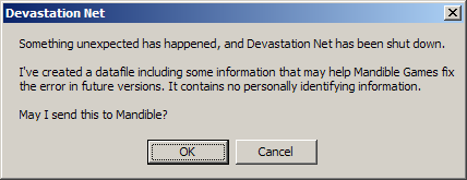
There's a lot of subtlety in a crash reporting system. For example, I've got mine rigged up so I can return messages, based on the game version, before the potentially large crash dump is sent. So if I start getting flooded with crashes that I've fixed, I can tell people to go download the new improved version, please, and stop bothering me with things I already know. (Perhaps not in those words.) Not only that but I can also return messages after the crash dump is sent, so I can analyze it server-side and return things like "your graphics card sucks" or "your RAM is bad". And it transmits the data in a compressed form to save on bandwidth, and it records as much information as I can without violating the privacy of my users.

Oh, yeah, that too. I don't violate user privacy. I don't send a single byte before the user has said "yes, I am fine with sending my debug log to Mandible." I've carefully checked the debug file to make sure I don't include anything that's identifiable (and removed a few debug printouts that went a bit too far, in fact) – the worst I can do is tell you what kind of graphics hardware you have, and what kind of joysticks you have plugged in. Which is obviously kind of important for debugging. I do not feel bad for including this.

Any kind of reporting of this type, of course, has to be agonizing careful about privacy issues. And, inevitably, someone is going to get annoyed at what I'm doing.

At least this way, I can tell them to just click "no".

Evolutionary Interface Design

2008, January 30th 5:26 PM

One of the trickiest issues with designing any novel game is the interface. If you're putting together a first-person shooter or a MMORPG it's easy – you just do what everyone else has done before, unless you really think you have a brilliant new idea. (Chances are good that you don't.) Any game more complicated than that and you're going to need to invent something new.

One of Katamari Damacy's (many) charms was its two-axis control system. While that control scheme wasn't new (Virtual On's twin sticks come to mind, and I'm certain VO didn't create it either) it provided quite a lot of control over your Katamari – not the most precise control, but you never found yourself saying "if only I could move to the left". You didn't fight with the interface. You fought with the Katamari sometimes, but the player ended up saying things like "man, a large katamari is really hard to maneuver", not "this interface is terrible and I think the game designers should be shot."

I've played games where the latter happened. They aren't fun.

For any game with novel mechanics, you're going to have to make certain that the player can pick up on the key assignments quickly. Fighting with your controller isn't fun, even when fighting with the monsters can be. The game industry is littered with games where the interface hurt what could have been a great game (PN03, Red Steel) and where a well-built interface sent a game from "good" into "great" (Abe's Oddysee, Guitar Hero).

Interface design in Devastation Net has been problematical since the very beginning.

First off, D-Net is meant to be played with game controllers. This isn't a problem on an actual game console. A PC, however, is not a game console. When you plug a controller into a conventional game console, the console knows which button is which. Your PS2 has no trouble distinguishing between the "circle", "square", "triangle", and "cross" buttons. On a PC, a game controller shows up as a pile of axes and buttons. A PS2 controller, as far as my computer is concerned, is four axes, twelve buttons, and a hat switch.

There isn't standardization on which button is which. The buttons are in a random order, depending on the manufacturer of the controller or adapter. Even the axes might be mirrored – you can rely on the first two axes, but when you have a dual-stick controller (like all the modern standard controllers) the remaining axes might be in any order.

Partly, I could avoid this problem simply by not using gamepads. I admit I'm taking a more difficult position on this one than necessary, and of course I do support keyboards. But D-net is designed so that you can support a dozen players on a single computer – and for that, you fundamentally need gamepads.

Making those gamepads useful has been a problem in itself.

In most areas, you can find UI experts who will do excellent jobs of designing an interface for you. This is because the principles of UI design are mostly understood by now. We know where to put buttons, we know how to lay out screens so humans can comprehend them.

Games are tougher. The only time a game needs a serious amount of thought on the controls is when the game is trying to do something new. If I was writing a first-person shooter on the PC I would just duplicate Unreal Tournament's controls. There just aren't many top-down tank games, though, and there are even fewer that work with game controllers.

I ended up with a few different control methods. The standard mode was the obvious one – one axis for turning your tank, one for moving forward and backwards. Next I had a more automated mode, where you would move the stick in the direction you wanted your tank to go and the computer would try to figure out how to do so. And finally I had a mode inspired by Katamari Damacy, where you would control each tank tread separately. With each of these modes, each axis could be chosen separately by the player.

The computer-controlled mode quickly proved a dismal failure. The computer would happily drive into walls, and trying to write enough intelligence into it to not do so was difficult at best. On top of that, I didn't want the player's tank to be controlled by a computer. It's a player-vs-player combat game – not a computer-vs-computer combat game.

Katamari Damacy mode was a failure as well. With D-Net style tank combat, you spend a lot of time rotating in place trying to aim, or moving directly forward and backwards when you're aimed properly. Doing this with two treads was simply difficult – it was fun, but it wasn't particularly intuitive.

Standard Mode, as people usually set it up, was surprisingly ineffective as well. Most people would make a single stick do both turning and moving – move the stick left to turn left, move the stick forward to go forward. But those two, again, are things that people want to do separately.

It turns out the best control method (at least, the best we were able to find) is to have "forward/back" on the left stick, and "turn left/right" on the right stick. In fact, it's so much better than the others that everyone quickly started using it.

As a result, that's the one D-Net now suggests. In fact, I've removed all support for the computer-controlled mode and for Katamari Damacy mode. To a large extent, more options is just confusing – adding dubious control methods doesn't make a difficult-to-manage game any easier.

At the beginning of this project, the controls were hardcoded. In the middle I had more options than anyone wants. Now, I've got a control scheme that's simple and very effective.

It's far more subtle than you think.

2007, February 2nd 1:27 PM

User interface design is hard.

Not because it's hard to invent interfaces. Oh no, it's easy to invent interfaces. You can throw the suckers together in minutes once you've gotten a little practice. And not because it's hard to invent usable interfaces. That part is hard, actually, but with a little introspection and a lot of blind testing and a whole hell of a lot of agonizing and rewriting, you can make them work. No, the problem is to invent intuitive interfaces. Because intuitive interfaces are usually far, far more complicated than anyone would expect – since, after all, they're intuitive, and they look so easy.

Right now I'm designing a level editor. It's a 2d editor, used to create curves and paths. It doesn't have very many general classes of "thing" it has to deal with yet. There are paths which have centers. Paths are made up of nodes. Nodes may have curve controls on them. Lines connect the nodes in a loop, either curved or straight depending on the curve controls.

Fundamentally it's quite simple. Here's a screenshot, and I imagine most people feel they could jump right in and start moving points around easily.

Well, you're right. You could. You could grab a point, and drag it, and it would move (and, in fact, the point on the other side of the figure would move too – this particular path is set up with vertical symmetry, which the editor will happily preserve for you. Classy, no?) Note that one point is selected right now – the one that's red, in the upper left – but really that doesn't matter much, you can drag any node around at will, and if there are multiple nodes on top of each other you can just click multiple times until you have the one you want selected. You could also right-click a line to toggle it from "curved" to "straight", and the curve handles will automatically go away. And come back if needed. Pretty neat, huh?

You have no idea how complicated all this stuff is.

Imagine the actual code behind it. The user clicks on a node. The program must select this node. Now the user drags the mouse, and the node moves with the mouse. That's easy.

But what happens if the user clicks on the node again? I've mentioned that you can cycle through nodes by clicking, so we could just have it select the "next" node at that position, whatever that means. Sounds reasonable. Except then the user selects a node, and drags it coincidentally on top of a second node, and changes his mind, and drags it further . . . but whoops, he got the wrong node. The program changed to the next node when he clicked. That wasn't supposed to happen.

Instead, we could make it so the node change happens when the user lets go of the button. Only now we have a different problem – the user selects a node, moves it coincidentally over another node, and lets go . . . and it selects the other node. That's not the right behavior either! We shouldn't change nodes in that case. And, in fact, there's a further problem – if I select a new node that happens to be in a stack of three or four nodes, then let go of the mouse button, it will change to the second node in the stack when I let go of the button.

After some thought, you can come up with the following process to solve these problems:

  • The user clicks. If the currently selected item is not underneath the mouse button, it selects whatever is underneath the mouse.
  • The user may or may not drag the mouse. If they do, move the currently selected item.
  • The user releases the mouse button. If an item was not selected, and the user did not drag the mouse, and there is a second item under the mouse that can be selected, select that one instead.

Note that I still haven't defined "second node" or "next node" or anything like that. Oh, also, there's a bug in that process, which I'm not going to point out. (Find it! It's a challenge!)

But we're not even done. Remember, there's four things in this universe that can be selected – and lines aren't draggable! But you can right-click them to change if they're curved. Or you can right-click nodes to lock their curve controls to "straight", so there are no obvious angles to that node. But curve controls, or the path center itself, can't be right-clicked (even though they can be dragged.) And if the "add node" button at the top is selected, then clicking a curve creates a new node at that position. What happens if you click "add node" and then click a curve control? What if it's a curve control on top of a line? What if you right-click it?

And now I have to go, rip out a hundred lines of code, and rewrite it, because my current approach just doesn't work.

User interface design is hard.